Monday, October 15, 2012

GELLI MONOPRINT

This is another Gelli ghost print enhanced with a letter stencil,
 doodling around the donut image and journaling.  
I'll show you the before and after image so you can get an idea of 
how much...or I should say how little it is altered.

After

before

I really love the ghost prints because of all the texture 
and the way the white paper peeks through....  
but I haven't tried to alter the parent prints yet and who knows.
I may like them better after they're completed. 

That will be next!

Till next time!  Hugs!
Ginny

Saturday, October 13, 2012

THREE BIRDS GELLI MONOPRINT


OK, so here is the finished Gelli monoprint enhanced with lettering 
and Ranger Distress Ink applied with a brush.  
You can see that I am a person of few words and like to repeat words 
for decorative purposes.  
This is a technique I use a lot because......
I NEVER KNOW WHAT TO SAY!!!  

Seriously!!
I envy people who can spill their thoughts onto paper...I'm just not like that.  
I am somewhat of a private person and don't like to spill my personal life
 on my journal pages for everyone to see.  
What am I doing blogging you ask?  I hope to change!  
In the mean time, I will depend on the words of others and use quotes 
that have meaning to me.....or repeat words for decorative purposes.  

Till next time,
Ginny xoxo

Thursday, October 11, 2012

GELLI PLATE MONOPRINTING

Shriek!!!
My Gelli Plate has arrived!!
If you haven't heard about the new art product in town...
the Gelli Printing Plate used for monoprinting...
you have not been blog hopping.  Everyone is giving it
rave reviews and creating some pretty awesome art prints.  I can't wait to
get started but first let me explain that you don't have to use the
Gelli Printing Plate which is a hefty $29.00 plus shipping for the
larger 8"x10" plate.  You could make your
own by using Knox unflavored gelatin and water.
There are plenty of recipes and You-Tube videos on the
internet so I won't go over them here but I will say that
you do have that option.


I chose not to go the gelatin route because it would take a little
forethought to make the plate beforehand and I know that I probably
wouldn't do it.  Also, the gelatin only lasts for up to two weeks and
would take space the refrigerator.  Which I don't have!
So, I opted to buy the Gelli Printing Plate which will be ready and
available whenever I have the urge to play!

The BEST tutorial for using the Gelli Printing Plate is the
Gelli web site:  http://gelliarts.blogspot.com.
Joan Bess who hosts the site is simply amaaaaazing!!  She pretty much
covers it all...she uses stencils and masks,  purchased rubber stamps
and homemade moldable rubber stamps, and found objects.
 She shows how to enhance the print afterward by using dyes, inks, acrylic
glazes and watercolor as a tint.  This lady has loads of ideas and creates the
most unbelievably gorgeous prints using techniques you
would never have dreamed of!  Also, did you know that you can use
the Gelli Printing Plate to print fabric too?
Shriek!!!
Yes, you can even print FABRIC!
Think of the possibilities!!!!

OK, let me show you some of my first attempts using a Gelli plate and what I have learned thus far.  For this first print I used three colors of soft bodied Liquitex acrylic paints and printed them in this order: Light Blue Violet, Indian Yellow and Deep Magenta.  (Any soft bodied acrylic paint or craft paint will do.)  I fully covered the plate with paint for each printing and used stamps, stencils and flower masks for each.  Also, I fully cleaned the plate with water and a baby wipe between printings but I didn't always clean the roller, stencils or masks.  Most of the time the paint was dry and wouldn't transfer to the plate anyway. 

This first print taught me that too much of a good thing can muddy the pot!  I did too much mark making and stenciling with each layer and lost much of the detail. You can't even see the letter stencil through all the layers! And....I had such high hopes!  Oh well.....this will make a nice journal page once I start adding to it.  


I have to say.....it takes a little forethought to decide in which order to layer the colors and when to apply the masks.  For example; If you use a light color for the first printing and then use a darker color and mask for the second printing, the area masked will be the lightest color.  If you did the reverse and used the darkest color for the first printing and applied a lighter color and mask for the second printing, the masked area would be the darker color.  So think about how the different colors and layers are going to work together and when to apply a mask if you are using one.  The process does have its surprises but you can manipulate the effect with some planning.

For my next attempts, I eased up a little on the mark making and stencils and even tried strategically applying the paint to specific areas and not the whole plate.

This next print was made by loading up the entire plate with color for the first two printings using India Yellow and then Bright Aqua Green.  I went a little easy on the stencils and mark making this time.  For the third printing I rolled the deep Magenta color only in the area of the birds, applied the bird masks, a funky ribbon and made a print.   There was paint left on the plate so I removed the bird masks and made a ghost print by using a clean sheet of paper and rubbing it over the plate.  I put this aside for use later.  I decided the print wasn't finished so I rolled the Light Blue Violet paint in select areas, used a circle stencil to remove some paint and printed for a fourth time.  Do you see what I mean about manipulating the print with some planning?


This is the ghost print made from the previous print.  After the birds, I printed the blue areas using stencils and masks and then printed the yellow area just using masks.  I started to embellish this by adding Ranger Distress ink (you could use pan pastels) to the background to soften some of the white areas and then added the inked outline of a "B" stencil.  See how different the ghost print is from the original?  It's all in the order of how the paint and masks are applied.  Two completely different looks!


Here are a few more mono prints using the same colors but in a different order. The first one is the original and the one that follows is the ghost print.  I think that I like the ghost prints better.  What do you think?


Look at all the delicious texture that is created by the Gelli Printing Plate.

Don't you just love it?

Till next time......
Ginny


Thursday, October 4, 2012

JOURNAL STORAGE

How many journals do you have in various stages of completion?
I counted mine and I have NINE!  And....this does 
not include the little children's board books that I recycled to use as journals...and
 incidentally, never did anything with them.  How on earth did I get to nine
journals and not a single one completed!!  Yikes!!

Now in all fairness, some of my journals are from classes that I have taken.
I finished the class but still have remaining pages in the journals which I will 
eventually fill with my art or use for another class.

NOW...the question is....
how do you store your journals so they are ready and available when you are?  
I ran out of shelf space ages ago with my ever-growing collection of art books
so I started looking to alternatives and came up with idea to store them in a large
BASKET!!! 

What do you think?


I have to tell you that it is a such a great feeling to be able to find just the right journal when creativity hits.....and without having to tear my studio apart.  If I feel like working on drawing faces, I might pull my Famous Women's Faces journal or if I am feeling especially grateful that day...I pull my gratitude journal.  You get the idea!  

Until next time xoxo

Ginny


Friday, September 21, 2012

SORRY TO SEE IT GO......

There comes a time when you have to say "goodbye."  
It's time. 
I will be sorry to see her go...she has been with me for a long time. 
It's kind of sad really because she still has a lot of life in her 
and I could keep her and try to make her useful but what's the point?  
She's not as fast as the newer models!
She never had a voice like Siri.
Her lens are not as sharp as they used to be but a good cleaning may remedy that.
Through no fault of her own, 
she can't communicate with her cousin, the new kid on the block.
But it's time to say goodbye.


And.............

Say Hello!

TO A NEW I-PHONE 5!!!!!!

I will be sorry to see her go but I am sooooooo excited about getting a new phone!!!!  YAY!!!! One that will be lighting fast and one that can communicate with my desk-top computer.  I have always had problems with the syncing of the phone and computer due to the error of two different Apple store geniuses.  I won't go into it here but the store manager was able fixed it as best he could.  Now it's up to me to reset my desk-top, download all the pics and apps on my phone, update the software on my phone and sync the two!  Why not just buy a new phone???   It will already be synced and the Apple store can transfer my apps.  Besides, my phone really is ancient.

After much debate as to whether I should buy the new phone or last years model, I decided to order the new phone on-line.  Hey!!!  Who wants to stand in line with all those crazies?  NOT ME!!  Anyway, I am told that they may not even have them available because they already ran out due to the pre-orders.  But that's OK....I am a verrrrry patient lady and can wait the two to four weeks for delivery.

Well...enough gibber jabber about the I-phone....did you notice the picture of the I-Phone case? That is the real reason that I will be sad to see her go!  When I first bought my phone, I bought one of those hard plastic, rubbery, hot pink cases (they didn't have a lot to choose from) to protect it from damage in case it got dropped. After a while, it began to look soiled and there was nothing that I could do to get the oily looking stains off of it.  Sooo....I PAINTED IT!!!  That has been about 2 1/2 years now and there is no sign of wear.

This is how I painted it:

  • I was concerned that the type of plastic, with the rubbery feel would not accept the paint well so I decided that I needed to use a primer of some sort.  What better primer than Mod-Podge?  Mod-Podge, I have heard (can't confirm this) is really watered down white glue.  A GLUE!!!!  That should make the paint stick!  So first, I washed the case thoroughly, let it dry and primed it with Mod-Podge.  This probably will not work if you have one of the phone cases that stretches into place.  My case is very hard plastic that snaps into place.  It needs to be a hard case.
  • Next, I painted two coats of a craft acrylic paint for the base.  Nothing fancy here, I didn't use my expensive paints.  Also, use a pretty pastel color because you are going to doodle on it with markers.
  • Now comes the doodling.  I doodled the entire design first with a black Micron Pen and then colored it with Martha Stewart permanent markers.  I am sure that other brands of markers will work just as well but make sure that they are permanent and not water soluble.
  • Time to add DOTS!  For this I used the handle of a paint brush and white acrylic paint. I dipped the brush handle into the paint and then stamped on the design.  If you stamp several times before reloading the paint, the dots will get smaller and smaller. I used this to my advantage and stamped in rows to make graduated sized dots. 
  • Seal your masterpiece with two - three coats of Mod-Podge.  YOU'RE DONE!!!! 
What better way to say that you are an Artist than to have a Phone Case painted by YOU with your very own design!!!  ENJOY!


Thursday, September 20, 2012

MY FAVORITE QUOTE BY ERMA BOMBECK

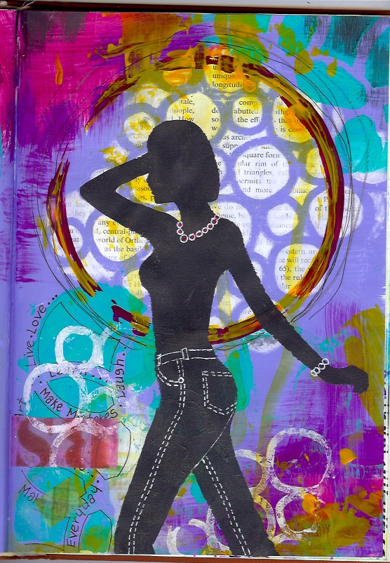
I always wanted to use this Erma Bombeck quote on a journal page.  Because I love to paint and draw it has so much meaning to me.


When I stand before God at the end of my life,
I would hope that I would not have a single bit of talent left,
 and I could say "I used everything that you gave me."


Wouldn't it be wonderful if in the course of a lifetime you were able to learn all there is to know about all art forms and to experience the use of all the many art mediums that exist in the world today? (I hate to admit it but I have a good start on that one.  That is.... owning many art mediums. Tee Hee...much to my chagrin!)  I would love to be able to stand at the pearly gates before God and say,  "I have no talent left...I used everything that you gave me."  I have lived my life to the fullest and squeezed every ounce of creatives juices from my body and soul.  I am so blessed that God entrusted me with the ability to create my art.  It is what makes my spirit sing.... it is who I am!

I painted these two journal pages in my altered book journal using acrylic paint.  I used several  techniques that I learned from Joann Luftus, a classmate in Joanne Sharpe's Color Love 101 class.  Joann Luftus is a super super talented mixed media artist who paints the most wonderful whimsical ladies and angels.  I loooove her angels!!  They are gorgeous!  I love all her work!!!  If you want to take a peek, here is the link to her blog and Etsy store:  http://www.joannloftus.typepad.com   http://www.etsy.com/shop/whimsiesfolksies?ref=top_trail


HERE ARE SOME TIPS FOR PAINTING SIMILAR PAGES:

Both of these pages were painted in my altered book journal.  This journal is fast becoming my most favorite journal to use for all mediums.   It takes alcohol markers extremely well on un-gessoed pages, watercolor on gessoed pages, acrylic on both gessoed and un-gessoed pages and it is great to use for collage, Prismacolor pencils and Pan Pastels.  I really haven't found a medium that I don't like to use in this journal......and it cost me all of 50 cents at a Library sale!

To begin with, I only used four colors on these pages, plus white and grey (mixed white gesso with black acrylic paint).  It looks like I used more but that is because two of the colors are translucent and when they're painted over another color, they mix and create a third and different color.  I used Liquitex Soft Body acrylic artist colors.  OK!  OK!  They're not Golden but they fit my budget!  Besides, Liquitex are great paints and have been around forever!  Anyway, these are the scrumptious colors that I used:

Bright Aqua green, Light Blue Violet, 
Deep Magenta (translucent), and Indian Yellow (translucent)

I used two stencils for the background and made the one from a girl that I found in a fashion magazine.  I used card stock and a craft knife to make the stencil.  For the quote, I used a black Pitt pen which writes beautifully over acrylic paint.  And...did you notice how the translucent Magenta paint created the purple color when it mixed with the Bright Aqua Green?   And... the translucent Indian Yellow...well, I misted it with water and let it run all over the place and turn any color it wanted to be.

I added a few pieces of my homemade Washi tape and a piece of text from an old book and wal-la!  Done!
EASY PEASY!!!


Monday, September 17, 2012

RECYCLED ART - CIRCUS LADY

Don't throw away your failed art work or scraps of painted paper!!!  I repeat...don't throw them away!! Why you ask?  Because they can be recycled and used in future art projects.  Every painted piece of paper can be used in some form or another.  Even the newspaper print that you use to protect your table when spray painting those inky pages and even the paper towel used to clean your paint brush.  Save them all!!!

This next project is a technique that I learned from the very talented Joanna Grant, a fellow classmate in the Joanne Sharpe Color Love 101 Class.  Joanna recycles her art to make wonderful collage art pieces.     I have tried collage before but it never occurred to me to recycle my own art work.  If you would like to see some of Joanna's work, pop on over to her blog and Esty store:

http://joannabananadesignoriginals.blogspot.com
http://www.etsy.com/shop/joannabanana

HOW THE CIRCUS LADY WAS MADE:


First, you need an inky or painted substrate on which to paste all your art elements.  I chose a journal that I made in Joanne Sharpe's Letter Love 101 class. This was made by using watercolor paper, stencils and Dylusions and Ranger Colorwash sprays.

Next, look for art elements to use in your project.  Look at using your original art work including your art rejects, inky papers, saved magazine or newspaper pictures, ephemera, etc.  (Be careful if you sell your art work that you only use copyright free images.)  Now, decide which elements you wish to use.   Don't worry if you don't want to cut up an original or if the image is not the right size......we can copy and re-size them.

For this project, I didn't want to destroy ANY of my original art work, even the rejected pieces. You never know when you might want to use that particular piece again. So... I scanned and re-sized all the chosen elements using Photoshop Elements software.  You may have a different photo editing software that will work just as well and that's fine.  The important thing is that your software allow you to crop the scanned images. You don't want to waste all your precious printer ink just to use a very small portion of the picture.  Also, you need software that will allow you to include several images of varying sizes on one piece of paper. This will save a lot of printer paper!!  Hey!!  This tutorial is about recycling isn't it?  Well....we don't want to create more waste do we?

For this piece, I wasn't real particular about the size of the individual elements except for the lady's body which had to exactly fit the length of the page.  Everything else could be approximate.  Therefore, I scanned both the upper and lower parts of the body,  cropped and re-sized them to exact measurements.   I could not live without the resizing feature in Photoshop Elements.  It is probably the feature that I use the most!  It allows me to select the exact size in inches, pixels, millimeters and more.  If I want my finished image to be 3 inches tall, my printed image will be exactly 3 inches tall.

I wasn't too particular about the sizes of the remaining images so I eyeballed the sizes by first cropping and then dragging and dropping them onto a blank 8.5 " x 11" page.  I then stretched them to size by grabbing a corner and stretching until I felt the size was approximate enough for my use.  (Used Photoshop Elements)

Now we're ready to print but before we move on, I need to make a few comments about the printer and paper.  I happen to use an HP inkjet all in one printer that uses Viera ink.  It does a suitable job, although, the blacks are not as dark as I would like them to be.  I was able to improve this a little by selecting a better quality paper.  I now use Hammermill Color Digital paper.  So, keep in mind....the paper can make a difference!  

The picture below shows the inky journal and all the scanned and printed elements that I planned to use for the circus girl journal page.  Notice that I have several sizes of the same element?  I couldn't decide the size I needed so I made several different sizes.  The ones that I didn't use went to my recycle pile for use in a future project.


Oh!  Almost forgot the most important part....the inspiration for this piece was a picture that I clipped from a magazine of a girl riding a unicycle.  I only wanted to use the bottom half of the girl so I copied and re-sized it.  The top half of the girl was from a journal page and prior blog about using Washi tape to make "She Art."  You may recognize her!  Be creative and use a combination of your recycled art, clippings from magazines, newspapers, paper napkins..anything that your little ole heart desires!!!

Now...you're ready to cut out the elements, position them onto a painted substrate and when you are happy with the composition, glue into place.  I used a good quality glue stick like Elmer's Craft Bond Photo Stick. Don't make the same mistake that I made by buying Elmer's School Glue Stick.  (I bought six giant tubes!!  When I make a mistake, I make it big.  Ugh!) School glue is made for kids and does not stick to inky pages.

Once all the elements are glued into place, you can then add the finishing pen work, doodles, lettering or more.  For my piece, I added the tutu, arms and umbrella handle, pole for the yoga girl, and the tightrope wire.   That's it!!!

I hope that you enjoyed this tutorial and if you have any questions, please feel free to leave me a comment.  Have a happy recycling!!!

Ginny