Showing posts with label Prismacolor pencil drawing. Show all posts
Friday, September 15, 2017
PUMPKIN GIRL
Whew! I can stop holding my breath now...hurricane Irma is gone and luckily, I have no damage to my house or yard just a lot of leaves and small tree branches strewn everywhere. And...I HAVE POWER! I am so fortunate!
Many of my friends and family are still waiting for the electricity to be restored and are waiting in temperatures of 91 deg. Fahrenheit or above. Our State has never seen anything like this in our history and are just now beginning to understand its impacts. To give you an idea: All services have been interrupted and many people can not go back to their jobs because of the power outages. Streets are cluttered with yard waste waiting for the Cities and Counties to pick up the residue. Grocery stores had to throw out all refrigerated items due to spoilage and are waiting for the trucks to arrive in order to restock. Some areas are told to conserve water by limiting showers and flushing toilets and to boil drinking water (I am not one of them thank goodness). Many areas will not be able to rebuild without adhering to stricter and more costly building codes. This storm was a monster and its impact will be felt for a long time by many.
I was too nervous to do any drawing during the storm and now that it is past, it's time to get back to normal. So here goes...Pumpkin girl was created using good old dependable Prismacolor pencils. My "go to" medium for coloring my whimsical girls. I love how the colors build up into a creamy satin finish. For more information on how I use prismacolor pencils go here.
I like to sketch my faces in pencil first because it allows me a lot of tweaking with the eraser. I am not trying to get an exact likeness but I am trying to get some kind of resemblance to the inspiration photo.
Once I obtained the look that I was going for, I outlined the drawing using a Copic fineliner sepia pen. Then I erased the pencil lines. Prismacolors and pencil graphite don't mix, they will smear and muddy your colors, so the sepia ink works better. The ink is permanent and it gives you an outline but yet it is light enough to be covered by the colored pencil.
Hope you enjoyed "Pumpkin Girl." I can't show you my inspiration photo on this one as I actually snapped a picture of this girl from the TV. I thought that she has the most interesting face shape and features. Perfect for drawing a whimsical character.
Until next time.....
Hugs,
Ginny
Sunday, February 16, 2014
WE DO NOT NEED MAGIC TO CHANGE THE WORLD
This is a quote by J. K. Rowling that I stumbled upon and thought that it was perfect for my journal page:
"We do not need magic to change the world.
We carry the power we need inside ourselves already.
We have the power to imagine better."
J.K. Rowling
J.K. Rowling
I hadn't planned for it to be about magic. She was going to be a modern day "Alice In Wonderland" but it didn't work out. When I put the rabbit in her hand...she looked more like a magician than Alice. Oh well, sometimes those things happen and you just have to go with the flow!
I drew the top hat as I couldn't find one without going through the trouble of scanning, resizing, etc. It was just easier to draw one from scratch. The chalkboard effect was a pleasant surprise…I drew the radiating lines with white Prismacolor pencil and then roughed in the lettering with a white charcoal pencil. I like the look so much that I quickly grabbed the Krylon Fixatif and gave it a spray. If I had gone over the charcoal lettering with white paint pen in my usual style…it would have competed with the white scrollwork and the white stripes in her shirt. I hope that you like her!
Until next time….
Hugs,
Ginny
![]() |
| Collage before the pen work |
Hugs,
Ginny
Friday, February 7, 2014
MOVING RIGHT ALONG
I'm moving right along in my "Teesha Style" collage journal. I'm working on several pages at a time. First, I prep four pages, front and back, next….I do the collage work on all eight pages and lastly, I finish each page with paint, ink and pencil. Working this way really seems to speed up the process as I can do all of the collage work in one sitting and utilize many of the magazine clippings that I planned for use and then decided otherwise….I find a use for them somewhere while they are still fresh in my mind.
Here is my latest journal page. I really like the way that this page turned out. I love the colors and the wormhole pattern used for her hair and tree roots. Also, an unexpected feature is the way that the Prismacolor pencil bled through the white pen used to write the word "When"…. giving it an ombre look. What a happy accident!
Well, until next time!
Hugs,
Ginny
Here is my latest journal page. I really like the way that this page turned out. I love the colors and the wormhole pattern used for her hair and tree roots. Also, an unexpected feature is the way that the Prismacolor pencil bled through the white pen used to write the word "When"…. giving it an ombre look. What a happy accident!
![]() |
| Completed journal page |
![]() |
| Journal page before embellishing |
Well, until next time!
Hugs,
Ginny
Sunday, December 15, 2013
HOW I PAINT MY LETTERING
Ok! I had a request for a tutorial on how I paint my lettering in my collages. This is something that I learned by watching Teesha Moore in a Mermaid Circus video and that I adopted for my own colleges because it is very easy for me to do...and I think that it really gives my collage work a polished look.
Here goes: I mainly use Molotow paint pens but you can use any acrylic or poster paint pen with an extra fine or fine tip. I have a collection of the Molotow (1mm, in black and white and all other colors 2mm), Painters (Elmer's) and Sharpie (poster and acrylic paint pens. Not oil!) that I use for this purpose. I find that the acrylic paint pens will write over almost anything, even waxy Prismacolor pencil backgrounds. Note: The white Signo Uni-ball pen also works great but it is not waterproof so I opted to use the acrylic paint markers instead. Also...a nice feature of the Molotow markers is that they are refillable.
The first thing that I do is to layout the words using a General's white charcoal pencil. I play with the size and position of the words to ensure that they all fit within the allocated space. Just rough it out…you don't have to be too neat or precise at this stage. The important thing is that the words are positioned where you want them.
Next, I draw the letters. If you have taken any of Joanne Sharpe's lettering classes, you will recall where she said to use your own lettering and fatten it up…add curlicue ends, serifs, etc. Make it your own! This is what I do…I make a block letter in upper or lower case and then fatten up the letter on the curves and some straight lines (this is just my personal preference). You might want to experiment to see what works for you. I form each letter, fatten it up and add the serif before I go on to the next letter. I watched Teesha do it this way and it made perfect sense to me. If I made the whole word before I fattened it up and added the serif, I was then trying to condensed the letters to keep them from running into each other.
Once all the lettering is done with the base color...go back and erase the charcoal lines with a kneaded eraser.
Add the shading: Shading can be done using a paint pen, alcohol marker, or colored pencil. I like the clean look of a paint pen so that is what I usually use. Again, this is just my personal preference. Use what you like.
When choosing a color to shade with, I often experiment until I find the look that ties the lettering to the rest of the collage. Sometimes it is a paint marker that is in the same color family but darker than the background or sometimes a contrasting color works best. Even a medium color letter, blue for example, looks great with a white shadow or outline. There are no mistakes here…experiment and try to find what looks best. If you don't like it, just paint over it with another color.
Where to make the shading: I always like to shade the left and bottom of the letters because I always make the light source in my collages come from the upper right corner. Pay attention to where the light source is coming from and shade the opposite side of the letter. Your collage may have a light source coming from the bottom and left side of the page and therefore, the shading will be on the right and top side of the letter.
There you go…that's how I paint my lettering.
Now…go have fun!
Until next time!
Hugs,
Ginny
Here goes: I mainly use Molotow paint pens but you can use any acrylic or poster paint pen with an extra fine or fine tip. I have a collection of the Molotow (1mm, in black and white and all other colors 2mm), Painters (Elmer's) and Sharpie (poster and acrylic paint pens. Not oil!) that I use for this purpose. I find that the acrylic paint pens will write over almost anything, even waxy Prismacolor pencil backgrounds. Note: The white Signo Uni-ball pen also works great but it is not waterproof so I opted to use the acrylic paint markers instead. Also...a nice feature of the Molotow markers is that they are refillable.
The first thing that I do is to layout the words using a General's white charcoal pencil. I play with the size and position of the words to ensure that they all fit within the allocated space. Just rough it out…you don't have to be too neat or precise at this stage. The important thing is that the words are positioned where you want them.
Next, I draw the letters. If you have taken any of Joanne Sharpe's lettering classes, you will recall where she said to use your own lettering and fatten it up…add curlicue ends, serifs, etc. Make it your own! This is what I do…I make a block letter in upper or lower case and then fatten up the letter on the curves and some straight lines (this is just my personal preference). You might want to experiment to see what works for you. I form each letter, fatten it up and add the serif before I go on to the next letter. I watched Teesha do it this way and it made perfect sense to me. If I made the whole word before I fattened it up and added the serif, I was then trying to condensed the letters to keep them from running into each other.
Once all the lettering is done with the base color...go back and erase the charcoal lines with a kneaded eraser.
Add the shading: Shading can be done using a paint pen, alcohol marker, or colored pencil. I like the clean look of a paint pen so that is what I usually use. Again, this is just my personal preference. Use what you like.
When choosing a color to shade with, I often experiment until I find the look that ties the lettering to the rest of the collage. Sometimes it is a paint marker that is in the same color family but darker than the background or sometimes a contrasting color works best. Even a medium color letter, blue for example, looks great with a white shadow or outline. There are no mistakes here…experiment and try to find what looks best. If you don't like it, just paint over it with another color.
Where to make the shading: I always like to shade the left and bottom of the letters because I always make the light source in my collages come from the upper right corner. Pay attention to where the light source is coming from and shade the opposite side of the letter. Your collage may have a light source coming from the bottom and left side of the page and therefore, the shading will be on the right and top side of the letter.
![]() |
| 1. Draw letter with charcoal pencil 2. Draw block letter 3. Fatten letter 4. Add serif. 5. Shade letter. |
There you go…that's how I paint my lettering.
Now…go have fun!
Until next time!
Hugs,
Ginny
Saturday, December 7, 2013
COFFEE, LATTE, EXPRESSO…OH MY!!!
I finished this journal page several weeks ago and didn't post it because it wasn't one of my favorites. It seemed out of character with the other pages in my journal but HEY, isn't that what journaling is all about…letting the work flow and seeing what comes out??? And sometimes the resulting work IS something different and out of character with your other works…that's how new directions or new styles happen!
I wouldn't exactly say that this is a new direction for me but it certainly shows my state of mind when I created it. I was apparently craving coffee….or screaming COFFEE! lol!
Hmmmm, coffee does sound good right now. Well, I'm off to make a cuppa…...
Credits: Collage sheets from Shelly Massey, Glitterbug, and PaperScraps.
Until next time!
Hugs,
Ginny
I wouldn't exactly say that this is a new direction for me but it certainly shows my state of mind when I created it. I was apparently craving coffee….or screaming COFFEE! lol!
Hmmmm, coffee does sound good right now. Well, I'm off to make a cuppa…...
Credits: Collage sheets from Shelly Massey, Glitterbug, and PaperScraps.
Until next time!
Hugs,
Ginny
Wednesday, November 13, 2013
"I'M HENERY THE EIGHT I AM!"
As I was working on this collage the song "I'm Henery The Eight I am" kept entering my head. Remember the song of the 60's by Peter Noone of the The Hermits ? Some of you may be too young. Anyway, I really enjoyed working on this piece as I love the old painting's of the "Master's" (although, the artist of this portrait is unknown) and even more…I love to alter them!!!!
While working on this collage, I thought that it was appropriate to cover King Henry's face with a mask to represent the fraudulent depiction of the King in his portrait's. If you don't know the history behind the King's portraits, it goes like this...the King's portrait artist, Hans Holbein In The Younger, painted the King as a young, tall, strong and imposing figure when in truth… he was aging and in his 40's, had short legs, his shoulders in the painting were heavily padded, and he was in poor health. Not the powerful and mighty warrior that is shown in many of his portrait's. It is said that the King liked this image so much that he encouraged other artist's to copy Hans Holbein's portrait of him.
I hope that you enjoy the altered Master's painting and give this a try!
Credits: Blue damask is a die cut from a Cricut cartridge, the "Make Art" is from a collage sheet by Shelly Massey, and everything else is cut from various magazines.
Until next time!
Hugs.
Ginny
While working on this collage, I thought that it was appropriate to cover King Henry's face with a mask to represent the fraudulent depiction of the King in his portrait's. If you don't know the history behind the King's portraits, it goes like this...the King's portrait artist, Hans Holbein In The Younger, painted the King as a young, tall, strong and imposing figure when in truth… he was aging and in his 40's, had short legs, his shoulders in the painting were heavily padded, and he was in poor health. Not the powerful and mighty warrior that is shown in many of his portrait's. It is said that the King liked this image so much that he encouraged other artist's to copy Hans Holbein's portrait of him.
I hope that you enjoy the altered Master's painting and give this a try!
Credits: Blue damask is a die cut from a Cricut cartridge, the "Make Art" is from a collage sheet by Shelly Massey, and everything else is cut from various magazines.
Until next time!
Hugs.
Ginny
Saturday, November 2, 2013
MARILYN MONROE COLLAGE
This time I thought that I would experiment by using copies of my own art work and free collage sheets downloaded off the Internet. I am happy with the overall results but I am not happy with the quality of the print from the downloaded collage sheets.
Here's the problem…the prints from the downloaded collage sheets are not knife sharp and the blacks are not true black…they seemed a little blurry and washed out. I have a high resolution (as far as home inkjet printers go) HP photo printer that is supposed to give sharp quality prints so I thought that I would do a little research to see if it was something that I was doing wrong, could do better by making a few adjustments to my equipment or if I need to go shopping for another type of printer.
I first tried changing the paper. Everything that I read about HP printers said that you need to use HP paper for the best quality prints. I always believed that this was just a sales pitch to sell more HP paper but I have to say…it did make a difference!!! One down! Next, I set the print adjustments for my printer to "Best" and changed the paper type to "specialty type." That helped even more! Wow…Now I was getting somewhere! Then I tried different types of HP paper ( just so happens that I had a sample pack that came with the printer) and got the best print with the card stock which I later found out that they no longer sell….ugggh! I don't want to use card stock…it is too thick for layering. Back to square one!!!!!
I know that someone has to have a printer that is not a large format like the Epson, uses pigment inks so that I can use Mod Podge without the ink smearing and one that make knife sharp prints with the blacks printing a true black…not grey! If anyone has any suggestions, please leave a comment below.
Here's the problem…the prints from the downloaded collage sheets are not knife sharp and the blacks are not true black…they seemed a little blurry and washed out. I have a high resolution (as far as home inkjet printers go) HP photo printer that is supposed to give sharp quality prints so I thought that I would do a little research to see if it was something that I was doing wrong, could do better by making a few adjustments to my equipment or if I need to go shopping for another type of printer.
I first tried changing the paper. Everything that I read about HP printers said that you need to use HP paper for the best quality prints. I always believed that this was just a sales pitch to sell more HP paper but I have to say…it did make a difference!!! One down! Next, I set the print adjustments for my printer to "Best" and changed the paper type to "specialty type." That helped even more! Wow…Now I was getting somewhere! Then I tried different types of HP paper ( just so happens that I had a sample pack that came with the printer) and got the best print with the card stock which I later found out that they no longer sell….ugggh! I don't want to use card stock…it is too thick for layering. Back to square one!!!!!
I know that someone has to have a printer that is not a large format like the Epson, uses pigment inks so that I can use Mod Podge without the ink smearing and one that make knife sharp prints with the blacks printing a true black…not grey! If anyone has any suggestions, please leave a comment below.
The majority of the border and the top of Marilyn's dress is from the free collage sheets by Shelly Massey and Angellea (Glitterbug via Flickr). Some of the border and Marilyn's face are copies of my own art work. The arms, legs, hoop and gecko are from magazine clippings.
CAUTION! A word of caution about getting free collage sheets from the internet, especially from Pinterest…the artist may not have given permission for its use even if the Pinterest sub-title says that it is free. I always double check by going to the blog or Flickr account of the individual offering the free work to confirm that they allow their work being downloaded and used in other peoples art. Also, to see if there are any stipulations to its use such as mentioning credit. I always try to do this…it's just NICE!
Until next time.
Hugs,
Ginny
Monday, October 28, 2013
HAPPY HALLOWEEN!
Have a very safe and fun Halloween everyone!
I am going to stay home and pass out candy to the neighborhood kids and
hope that all the candy is gone by the end of the evening so
that I am not tempted to eat any!
DARN DIET!!!!
I found this interesting guy in a magazine. I can't remember the name of the candy bar he's advertising. Anyway, for those of you who have Cricut machines...do you recognize the spider web, cat, fence and tree? I think that it came from the Paper Doll Dress Up cartridge. I cut it out years ago and just now find a use for it. Since this journal page, I have incorporated several Cricut embellishments into my pages. Finally....I have found a use for the Cricut machine (I am not a scrapbooker).
Hugs,
Ginny
Friday, October 25, 2013
"THE GYMNAST" COLLAGE
Recycling is so important to me and one of my evening rituals is to clip interesting collage fodder from old magazines while watching TV. It is my down time...a time to start unwinding from the days activities and to start preparing my body for bed and a restorative sleep. At least that is what I am supposed to do according to a Holistic Nutritionist that I have been seeing but even clipping magazines gets me excited...especially as I start imagining how I can use them in my collages. Eeeeek! A creative mind never rests!!!
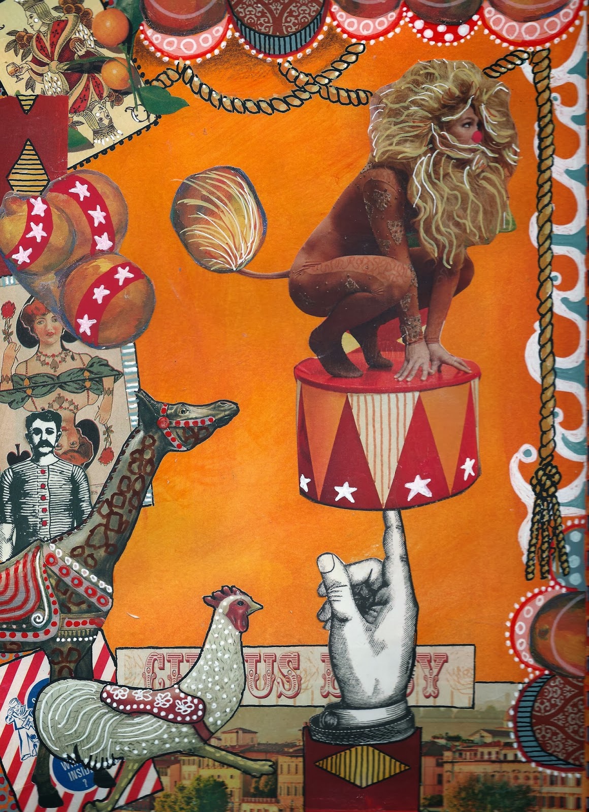
Anyway, this is a story about a gymnast turned Circus performer:
Why did she agree to do it she asked herself? Why did she agree to stand on top of a drum, balanced on the finger of a thirty foot high statue and dressed in a lion suit? She was a gymnast for gosh sake...not a circus performer! If only she had said "no" when the Ringmaster asked her to fill in for one of his performers who had taken ill. But she tried to say "no" and couldn't. All that he had to do was flash that crooked grin of his which revealed two hidden dimples on each side of his ruggedly handsome face and she was powerless...powerless to refuse him.
![]() |
| COLLAGE FROM MAGAZINES |
![]() |
| DOODLES ADDED |
![]() |
| FINISHED COLLAGE WITH SHADING AND LETTERING ADDED |
Until next time!
Hugs,
Ginny
Wednesday, October 23, 2013
ROXIE RACCOON COLLAGE
THIS COLLAGE WAS FUN!
I didn't intend it to be a picture of a raccoon...it just happened.
Although, my muse must have been steering me that way.
What would go better with all those FISH than a fish eating raccoon? lol!
Anyway, this is Roxie Raccoon and she has a story:
She thought that she heard a rap at the door...not just any rap. It was the same rap that her late husband used...rap...rap...rap...rap! Four distinct raps with a rhythm only Rodney used. How could that be she asked herself? With her heart pounding, she quickly ran to open the door and when she did...there standing before her was a duck with the same penetrating eyes as Rodney. "Oh my darling Rodney" she cried..."You have finally come home to me!"
![]() |
| Collage before embellishing with doodles and lettering |
I hope that you are having as much fun as I am imagining the rest of Roxie's story!!!
Until next time!
Hugs,
Ginny
Saturday, October 19, 2013
"I'LL ALWAYS BE UNIQUE" JOURNAL PAGE
I wish that I could remember which magazine I found this quirky model with the BIG hair...was it maybe Oprah? Anyway, she looked French so I tried to use that theme and even gave her an older dignitary boyfriend. Tee He!!! It's fun to make up a story in my head as I am selecting the collage pieces. Maybe the story would go something like this:
She was all decked out in her finest evening attire and with her hands on her hips, and a flirtatious look on her face, she did a little pirouette as her dignitary boyfriend watched from the top floor of the Embassy. She knew that she looked hot but what she didn't know is that with her hair piled high on her head...over four feet high...that there was no way in which she and her HAIR would make it through the DOOR! Her boyfriend just shook his head in disbelief! It was not going to be a fun evening!
Here is a progression of how I made the journal page:
![]() |
| Collage over a background painted with acrylic paint. |
![]() |
| Embellished with doodles and lettering. |
![]() |
| Shading and final touches added. |
Until next time!
Hugs,
Ginny
LET'S COLLAGE LIKE TEESHA
Okay everyone...GET YOUR APRONS ON!!!
We're going to collage and paint !
I told you that I would walk you through making a Teesha Moore type collage and share many tips that I learned from her in the class "Mermaid Circus." Well...here goes!
LIST OF SUPPLIES:
- Substrate...I like Mixed Media paper 140 lb. A heavy weight Watercolor or Bristol paper works also.
- Magazines and ephemera of all kinds.
- Matt Medium (I use Liquitex), Mod Podge or glue stick (Use a good glue stick one like Elmer's Photo or UHU, not School glue).
- Scissors
- Acrylic paint...craft paint or the more expensive variety. Any will do. My fave is Liquitex soft body acrylic in the small flip top bottles.
- Mister bottle filled with water.
- Two 1" wide flat paintbrushes. One to apply background color and a separate one to apply the Matte Medium.
- Acrylic paint pens. (Not oil based pens.) Extra fine and fine (1mm & 2mm). I like all brands..Elmer's Painter's, Sharpie, Sharpie Poster Paint, Molotow, Posca...to name a few.
- Gel Pens. I love the Gelly Roll Moonlight, Souffle and Neon.
- White Uni-ball Signo pen UM-153. (I buy these on-line by the box from Jet Pens). The best opaque white pen although the ink is not water resistant. If you need it to be water resistant, use an acrylic paint pen such as the 1mm Molotow. Good to have both.
- White charcoal pencil. Mine is General's.
- Kneaded eraser.
- Prismacolor Premier pencils for shading.
- Paper towels.
Tip: All types of glue have their pros and cons. The pro regarding Liquitex Matt Medium is that the Prismacolor pencil works well with it...the con is that it is very wet and the paper tends to wrinkle more than the other adhesives. The pro for Mod Podge is that it is easy to work with and wrinkles less but the con is that the Prismacolor pencil does not work well over it's slick surface. The pro for a glue stick is that the paper wrinkles less than the other two but the con is that it is difficult to apply to thin paper and larger pieces (it sometimes dries before the piece is applied). It takes practice and a little experimenting to find which adhesive works best for you.
Tip: A word about pens. I only use acrylic paint pens and gel pens over acrylic paint, matte medium or Mod Podge. I have ruined many a Micron, Pitt, Copic or other type of alcoholic marker by using them over acrylic paint and dried adhesive. It is also useful to know that gel pens are not water resistant and should be used last. Do not paint the matt medium or Mod Podge over the gel ink as it will dissolve the ink and smear. If this happens, use a damp paper towel to carefully wipe it off and start over (before it dries assures good results).
Tip: A good white and black liner that is permanent when dry and writes on most surfaces is the 1mm Molotow. These are also refillable.
PREPARING THE SUBSTRATE:
Squirt a little acrylic paint randomly on the paper. I may use two or three colors for this purpose. Keep the paint in the same color family or use analogous colors (next to each other on the color wheel). Do not use complementary colors or they will make mud. If you wish to use complementary colors just don't mix them together...use them side by side with minimal overlap or wait until the first color is dry.
After the paint is globed on the paper, mist the page lightly with water and then quickly paint and blend to cover the entire page. Just as quickly, grab a paper towel and rub the paint in a circular motion to create a smooth finish. (I learned this from Teesha.) Don't worry if it is not completely blended...most of the background will be covered with collage and what doesn't get covered, the little imperfections will add interest.
TIP: Teesha paints both sides of the page before she begins the collage work because wetting the back side of a finished collage with paint or Matte Medium may loosen the glue on the collaged side. (Why this never occurred to me before is beyond me!!!)
I paint both sides of several pages at one time...then do the college work on all the pages...and then embellish them when the mood strikes. I found it interesting that Teesha takes her work with her to the coffee shop and has several pages collaged and ready to embellish with doodles and markings. That way you only need to carry pens and pencils in addition to the collaged substrate. I haven't tried this yet but I plan to! Starbucks...here I come!!!!
FINDING COLLAGE MATERIAL:
Collage material is everywhere and needn't cost much. Here are some to consider:
- Magazines of all kinds. Look for colors and textures that you like as well as graphics and photos.
- Used art books or children's books.
- Wrapping and scrapbook paper.
- Printed paper napkins. These are three ply and need to be separated...only use the top and printed layer and use spray glue or gel medium to apply (they tear easily if the glue is too wet). Also, they are somewhat transparent so keep that in mind when layering over other collaged pieces.
- Your own printed papers. Gelli mono prints are great for this.
- Prints of your own art work.
- Prints of non-copyrighted art or photos.
- Free or purchased collage sheets.
- Ephemera such as old letters, photos, ticket stubs. candy wrappers, etc.
Tip: Teesha also recommends for their graphics...magazines such as, IND, 3X3, Hi-Fructose and foreign fashion magazines.
ORGANIZING YOUR COLLECTION OF COLLAGE PAPERS:
Now is a good time to talk about organization and how to store your collage papers. It would take way too much time to look through each magazine, book, etc. each and every time that you plan to collage. You must have a way to store and organize your papers. Whether you store and separate them in boxes or folders, find a system that works for you.
This is how I collect and store my papers: When I am finished with a book or magazine, I rip out the pages with interesting colors, textures and pictures keeping in mind how I might use them. For example, I might like the colors used in a magazine advertisement or the texture of a piece of clothing. These can be cut into shapes or used as boarders. I also cut out people and use the whole person or just a body part like a head, arm, leg, feet or hands. I also cut out any graphic or picture to use in it's true form, like a flower, shoe, purse, cat, dog, etc. Do you get the idea?
I separate and store my pictures in folders. These are some of the various categories by which I store my stash: Faces, Body Parts, Adult People, Children, Birds, Animals, Made Paper, Ephemera. Colors and Textures, Quotes, Words and Phrases, Famous Artist's Paintings, and Floral.
By filing my collage material this way, inspiration is only a folder away. I can look through a folder and always find a clipping by which to build a journal page around.
SELECTING COLLAGE MATERIAL:
First, I find my focal piece. In the collage of the girl in a raincoat, it was her big head with the blue hair. The next step was to build her body. I auditioned many magazine clippings until I finally decided on the raincoat. Next, I found her hands and legs in the "Body Parts" folder. See? If you have a filing system, it is easy peasy to find what you are looking for. I didn't have to thumb through several magazines.
Once the girl was decided, I started looking for ephemera and paper with the textures and colors that would go with the girl and background. I pull everything that might work and make the final decision later.
CREATING THE COMPOSITION:
I audition many pieces until I find the combination that works well together and then make the final cut and start laying out the composition. Don't put too much time and thought into this as when you start your mark making/doodling...things will really begin to change and that little piece of paper that you were fretting over...fades away.
There are, however, some basic rules that I like to follow. The first is that I like to repeat colors and patterns in more than one location on the page...second, I like to vary the size of the collage pieces (large and small) and third, I do not like to center the focal piece. I just feel that for ME...following these rules makes the page more interesting.
RULE OF THIRDS (Optional)
Rule of Thirds: Do you notice how I positioned the girl toward the left side of the page? I did this because I needed to leave room for the lettering and also because I like to use the "Rule of Thirds." In case you don't know what this is, it is a rule of composition that many artists and photographers use because it is believed to create more energy and interest. Wikipedia explains the "Rule of Thirds" as: "The guideline proposed that an image should be imagined as divided into nine equal parts by two equally-spaced horizontal lines and two equally-spaced vertical lines, and that important compositional elements should be placed along these lines or their intersections." The most important element in my composition is the girl's head so I positioned it toward the left and top third of the imaginary grid.
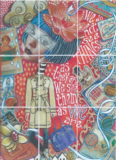
I only mention the "Rule of Thirds" because if you are having difficulty with the layout of your page and you are not liking it so much...try the "Rule of Thirds." It might change everything! However, if you are happy with the focal piece being centered...there is nothing wrong with that too. In Art Journaling...there are "No Rules." What matters is that YOU like it and are having fun with the process!
I do need to say, however, that Teesha has some spectacular art work where the focal piece is CENTERED! See? Just my personal preference!
GLUING THE COLLAGE PAPER TO THE SUBSTRATE:
When you are happy with the composition...start Trimming and gluing!
Tip: With so many pieces to glue...how do you remember your final layout and where to glue the pieces when you need to remove the pieces on top in order to glue the bottom pieces? Simple...take a picture!
Now...If you have never used Mod Podge or Matte Medium to glue collage pieces...this is the way that I do it: I always start with the bottom pieces and build the layers up as I go...the focal piece is usually last. I use a 1 inch brush (an old worn watercolor brush for this purpose. You could use a foam brush.) I apply the Matte Medium evenly to the substrate in an area large enough to cover the area of the piece that I am collaging. I position the collage piece where I want it and then brush over the piece to smooth out any air bubbles. In essence, you are now applying the Matte Medium that is left on the brush on top of the college piece.
The Matt Medium dries clear so don't worry about getting it outside of the working area. Just make sure to smooth it out so it doesn't leave ridges when dry. The trick is to use enough Matte Medium to adhere the piece but not to soak it. The wetter the piece (especially magazine clippings) the more wrinkles you will have but don't worry about them either...as the paper dries, a lot of the wrinkles will disappear.
When gluing with Mod Podge or Matte Medium...once you stick it down...there is no getting it repositioned without making a mess and ruining the paper clipping. Having said that...for pieces where the position is critical and for larger pieces, I leave the collage piece on the substrate and lift one side of it...apply glue under it and paint out the bubbles...then I lift the other side and do the same thing. Be sure that you get the glue under the middle area where the lifted sides meet!
Tip: When I use a glue stick, I always apply glue to the back side of the collage piece and then apply it to the substrate. Always apply the glue by starting in the middle and moving the glue stick out toward the sides and off the paper. This eliminates the problem of the glue globing under the collage piece. Use an old telephone book or magazine as a gluing surface to catch the excess glue. When the page gets covered in wet glue and there is no dry spot left just rip off the page to expose a nice dry page underneath.
DOODLING AND MARK MAKING:
Okay...Now is the time to grab all your paint pens and gels pens and start embellishing what you just glued down. But first...make sure that you have given your work enough time to dry. Using your pens over a surface that is not dry is a sure way to ruin your pens. I cannot stress this enough!!!!
I start my mark making by outlining pieces that need be lifted from the background or the piece below it. Next, I like to use a white pen and make dots or circles followed by using colored pens. I don't over think this process and find that if I doodle and then doodle some more...I usually like the end result. I keep going until every collaged piece has been marked in some way.
Now...I know what you are thinking! You may not be a doodler and don't know where to begin with making patterns. Well...there are lots of Zentangle books and books about doodling or you can even make your own. That's what I did because I am not a doodler either. I find patterns that appeal to me and draw them in a reference journal that I made for that purpose. I did the same thing with different lettering styles. Now when I get stumped for a pattern...I turn to my journal. This is a great way to prevent a creative block! Too much thinking can sometimes stifle your creative process!!!
LETTERING:
I have adopted Teesha's style of lettering (for now) because it is easy for me to do and I think that it looks great! It was amazing to watch Teesha letter because she does not lay it out in pencil first!!! She has been doing it for sooooo long that she instinctively knows how to space the letters and words. The other thing that Teesha does is to mix upper and lower case, the size of the letters and the angle of the words. Oh...I almost forgot...she fattens the letters and adds the serif as she writes them. In other words...she does not do all the lettering first and then go back to fatten them and add the tails.
You may have your own style of lettering or prefer something different from what I have used. There certainly are plenty of examples on the internet in which to choose from. Place as much importance in drawing your letters as you have in the art work. The lettering IS part of the art!!!!
Tip: Use a white Charcoal pencil to rough out the lettering first and once the ink is dry, erase any remaining charcoal by using a kneaded eraser.
SHADING AND FINAL TOUCHES:
I always like to have the light source coming from the upper right corner of the page. Another personal preference. However, you may feel more comfortable with just the opposite. When I shade the letters or objects in the picture, I shade the left side and bottom a darker color and if needed, highlight the opposite (light source side) side with a lighter color. Don't get too concerned about making this happen though...some of the pieces from the magazine already have their light source established and it may not agree with your overall scheme. Notice how the girl's head is darker on the right and lighter on the left? Just the opposite of how I shaded the rest of the collage. Oh well...It is what it is!!!! Hopefully not too many people notice! lol!
To add depth to the background and some of the key elements like the flower in her hair and the ribbon, I shaded with Prismacolor Primer Pencils. I love these waxy pencils because it is possible to go from very light, by using a very light touch and pressure, to a very dark color by applying a much heavier pressure.
I did not pay attention to the light source when shading the background and shaded all sides as well as all sides of the girl. I wanted to give the effect of the girl and boarder floating above the background.
HOW TO MAKE THE STRIP FOR THE EYES.
Because the raincoat is transparent, I wanted to give the illusion of something transparent over her eyes. I did this by placing deli paper over her eyes and drawing the eye area with a lead pencil. I used a white acrylic paint pen (you could use white acrylic paint) to paint the back of the deli paper. Once dry, I glued it to the face and outlined it with a black pen.
SOME OF TEESHA'S RULES:
1. She never tears anything and slaps is down. "Everything has a clean edge."
2. She never puts a square or rectangular shape piece of collage at a angle.
3. She never leaves "gaps between pieces" used in a border..".they need to be connected."
One final word...My collage work does not look anything like Teesha's latest work. I would love to be able to do what she does but there is only one Teesha and I think that it is important to keep your identity in your art and not try to be someone else. We are all unique! So...kick back, put on some music, enjoy the process and be YOU! Most of all...Have FUN!
There you have it!!! The process for making a Teesha Moore style collage.
I hope that you enjoyed this tutorial and decide to give collage a try. I also hope that you will someday have the opportunity to take a class from Teesha...that is, if you haven't already. She is an amazing artist and teacher!!!
Please let me know if you have any questions. I love to share my art experiences and would love to hear about your's also!!!
Hugs,
Ginny
Sunday, October 6, 2013
TEESHA MOORE INSPIRED JOURNAL
I just bought a new journal to work in and decided to dedicate it to Teesha Moore inspired collages. It is a Strathmore 9" X 12" Mixed Media Visual Journal with 140 lb. vellum finish paper and is larger than any of my other journals. It will be perfect for collaging!
I really had fun making these two journal pages and can't wait to make more! The process of selecting the papers to use in the college really appeals to my creative design sensibilities. A little known fact about me is that I have always had a desire to be an interior designer...I love to mix patterns, textures and colors. The second most fun thing that I like to do is drawing patterns and textures... making lots of tiny dots, drawing flourishes, shading with pencils and I can't forget the lettering.... I was a graphic artist once and could probably letter in my sleep! I guess when you put all of this together you can see why Teesha's style of collage really appeals to me. It is a mix of everything that I love to do!
I hope that you enjoy my latest creations! I will walk you through the process in my next post and share many tips that I leaned from Teesha in her on-line class "Mermaid Circus."
Teesha has graciously given her permission to share her journaling techniques. She states that "it has always been my goal to get as many folks as I can on-board with journaling. I think that we can make this world a better place if we are all creating everyday." Don't you agree with Teesha? I sure DO!
Until next time!
Hugs,
Ginny
I really had fun making these two journal pages and can't wait to make more! The process of selecting the papers to use in the college really appeals to my creative design sensibilities. A little known fact about me is that I have always had a desire to be an interior designer...I love to mix patterns, textures and colors. The second most fun thing that I like to do is drawing patterns and textures... making lots of tiny dots, drawing flourishes, shading with pencils and I can't forget the lettering.... I was a graphic artist once and could probably letter in my sleep! I guess when you put all of this together you can see why Teesha's style of collage really appeals to me. It is a mix of everything that I love to do!
I hope that you enjoy my latest creations! I will walk you through the process in my next post and share many tips that I leaned from Teesha in her on-line class "Mermaid Circus."
Teesha has graciously given her permission to share her journaling techniques. She states that "it has always been my goal to get as many folks as I can on-board with journaling. I think that we can make this world a better place if we are all creating everyday." Don't you agree with Teesha? I sure DO!
Until next time!
Hugs,
Ginny
Wednesday, June 26, 2013
PAINTED ARTIST TRADING CARDS
I have never made an ATC!!! No never!!!! I really don't know why...maybe because I see the small size as limiting or the thought of trading art work with other artists never occurred to me...or whatever was stopping me before...it is not stopping me now.
If you have been following my blog for very long you probably know that I have taken every single one of Joanne Sharpe's on-line classes. Yes, all of them and I am not alone...so have many others. And...after a while, you become pretty good friends with the other artists and become inspired and even influenced by them. That's how I became involved in ATC's. One of the artists in Joanne's class started a closed FaceBook group to trade ATC's. So....I thought that I would give it a try! "Nothing ventured, nothing gained."
To get started I cut up scraps of watercolor paper to size, grabbed my Tombow markers and various other pens and pencils and got to work making ATC's. Whenever I get stumped for ideas of what to draw, I always turn to faces. Faces are the most comforting to me, especially when you are not trying to draw anyone in particular. And...because of the small size of the ATC's, I thought that I would draw just part of the face and feature the hair by painting it bright colors like blue, green or pink. Here is the first of six that I made.
And this is how I made them.
I used:
Strathmore 300 Watercolor paper
Tombow watercolor markers
Prismacolor pencils
black Pitt pen, fine
Acrylic Paint marker, Painter's
Signo Uniball white pen
Koi waterbrush
White charcoal pencil

Lightly draw the girl in pencil.
Note: Use a good quality watercolor paper because the Tombow markers will not blend on an inferior paper.


In this step, I have deepened the shadows with prismacolor pencils and used a black Pitt pen for detail.
I used the Pitt pen to draw the stripes in the scarf, accentuate the facial features and necklace, and draw a border around the edge of the card..
I hope that you enjoyed this tutorial and give it a try!!! I welcome questions!
Hugs,
Ginny
Here are a few more ATC's using this technique.
If you have been following my blog for very long you probably know that I have taken every single one of Joanne Sharpe's on-line classes. Yes, all of them and I am not alone...so have many others. And...after a while, you become pretty good friends with the other artists and become inspired and even influenced by them. That's how I became involved in ATC's. One of the artists in Joanne's class started a closed FaceBook group to trade ATC's. So....I thought that I would give it a try! "Nothing ventured, nothing gained."
To get started I cut up scraps of watercolor paper to size, grabbed my Tombow markers and various other pens and pencils and got to work making ATC's. Whenever I get stumped for ideas of what to draw, I always turn to faces. Faces are the most comforting to me, especially when you are not trying to draw anyone in particular. And...because of the small size of the ATC's, I thought that I would draw just part of the face and feature the hair by painting it bright colors like blue, green or pink. Here is the first of six that I made.
And this is how I made them.
I used:
Strathmore 300 Watercolor paper
Tombow watercolor markers
Prismacolor pencils
black Pitt pen, fine
Acrylic Paint marker, Painter's
Signo Uniball white pen
Koi waterbrush
White charcoal pencil

Lightly draw the girl in pencil.
Note: Use a good quality watercolor paper because the Tombow markers will not blend on an inferior paper.
Using the Tombow markers, color areas of the paper.
Do not color the area solid as we are going to move the color around with water from a water brush or paintbrush. This will give it a nice watercolor look.
Be careful not to let the areas touch while wet unless you purposefully want the colors to blend.
I wanted the purple and turquoise to blend for the background but I did not want them to mix with the green hair. One way to avoid one color from bleeding into the adjacent color is to let each section dry before you paint.
Blending the colors with a wet paintbrush or waterbrush.
Wet the areas of the Tombow paint until it starts to flow and then push it around to cover the desired area to be painted. If you have to scrub with the paintbrush, you may not be using enough water. At the same time, be sure to get rid of the hard edges.
This may look a little watermarked or splotchy. If you don't like the way it looks, re-wet the area and push the color some more. This takes a little practice but also keep in mind that watercolor is supposed to be watermarked. Also, don't worry too much about a smooth background because it will be covered by the lettering.
See how the purple and turquoise is not completely mixed together? I was striving to blend the hard lines but still allowing both the purple and turquiose to maintain their true color. I was not trying to obtain a new color by mixing the two.
Leave some white paper showing in the area of her nose and chin...areas that you wish to come forward. The areas to recede are darker in color. This gives the face its rounded shape.

Now to add detail.
I used a medium purple Prismacolor pencil, Violet 1008, to start outlining the features of the face and to streak the hair.
I used a deeper green prismacolor pencil and a white Signo pen to add additional streaks to the hair. I also added shading to areas of the hair that would appear under her face or scarf.
I added color to the eyes, lips and scarf with Tombow markers.

In this step, I have deepened the shadows with prismacolor pencils and used a black Pitt pen for detail.
I added a dot of white highlight to the eyes and bottom lower lip and added more hair streaks with the Signo pen.
The red stripe on the scarf is Tombow marker.
The final step is to add the lettering.
I used a white charcoal pencil to draw the placement of the letters. This later erases beautifully using a kneaded eraser.
Next, using a fine tip paint pen, draw the letters.
Once the paint is dry, outline the letters with a Signo pen.
Once all pen work is dry, erase any visible charcoal lines.
Hugs,
Ginny
Here are a few more ATC's using this technique.
Tuesday, September 11, 2012
ANOTHER MIXED MEDIA GIRL
Wow! I have so many things to blog about and I am sure that once the novelty of having my own blog wears off, the posts will be less frequent but until then.....I will keep on posting!!!!
Also, I must tell you that I recently discovered the TV program "Doc Martin" and have become ADDICTED!!!!! And.....I have this beautiful 23" computer monitor in my craft room from which I can watch all the episodes and draw at the same time!!! I'm feeding two addictions at the SAME time! How great is that????
MIXED MEDIA GIRL:
This is another mixed media face that I painted using Tombow markers, and Prismacolor pencils. The background was made by using Derwent Inktense pencils with a layer of Ranger Distress Ink stenciled on top and a few doodles.
I took a picture of the first layer of medium....the face and dress painted with Tombow Markers and the background painted with Inktense pencils. Hopefully, this will show you how the painting can transform from what I call "the ugly stage" into something of beauty. So.... don't panic if the girl looks a little jaundiced!!! This can be fixed with the application of Prismacolor pencils.
Also, I must tell you that I recently discovered the TV program "Doc Martin" and have become ADDICTED!!!!! And.....I have this beautiful 23" computer monitor in my craft room from which I can watch all the episodes and draw at the same time!!! I'm feeding two addictions at the SAME time! How great is that????
MIXED MEDIA GIRL:
This is another mixed media face that I painted using Tombow markers, and Prismacolor pencils. The background was made by using Derwent Inktense pencils with a layer of Ranger Distress Ink stenciled on top and a few doodles.
I took a picture of the first layer of medium....the face and dress painted with Tombow Markers and the background painted with Inktense pencils. Hopefully, this will show you how the painting can transform from what I call "the ugly stage" into something of beauty. So.... don't panic if the girl looks a little jaundiced!!! This can be fixed with the application of Prismacolor pencils.
Now, here she is after a layer of Prismacolor pencil was added to her face; the stenciling, doodling and lettering added to the background and the other fine details added like her glasses, and heart headband.
So...."Don't Worry, Be Happy." You can easily correct the color of your girl!
Sunday, September 9, 2012
MIXED MEDIA FACE
This girl was painted on watercolor paper using Tombow Markers with a wash of water, Koi watercolor, Prismacolor pencils and Pan Pastels. I like the combination of the smooth blending that the Prismacolor gives with the painterly look of the Tombow Markers and koi watercolor. I also like that it does not have the hard edge of a black ink pen. This is a new technique that I learned from a very talented classmate, Linda Moore, from the Joanne Sharpe, Color Love 101 class. Linda made a great youtube video demonstrating the process. Here is the link: http://www.youtube.com/watch?v=KWCKTAKJBdk I know you will love it!
Notice the homemade faux washi tape? I have gobs of it and try to use it whenever I can. The text blocks are tape made from using old receipts.
Subscribe to:
Posts (Atom)