Thursday, December 19, 2013

MERRY CHRISTMAS EVERYONE!


"May PEACE be your gift at Christmas and your BLESSING all year through."

I love this time of year but it seems to sneak up on me and I always feel rushed to get all my shopping, baking and card making done.  Why don't I start earlier?  I tried shopping earlier…like the super sales right after Christmas but I sometimes forget the gifts, lose them, or find something better later in the year.   I think that I could take a lot of stress off myself if I only made my cards for next year by…let's say JULY!  I always say that I am going to do that!  Oh well…I have good intentions.

Anyway, I hope that everyone finds a stress free holiday season.  One filled with love, joy and peace.

Merry Christmas !

Hugs,
Ginny


Sunday, December 15, 2013

HOW I PAINT MY LETTERING

Ok!  I had a request for a tutorial on how I paint my lettering in my collages.  This is something that I learned by watching Teesha Moore in a Mermaid Circus video and that I adopted for my own colleges because it is very easy for me to do...and I think that it really gives my collage work a polished look.

Here goes:  I mainly use Molotow paint pens but you can use any acrylic or poster paint pen with an extra fine or fine tip.  I have a collection of the Molotow (1mm, in black and white and all other colors 2mm), Painters (Elmer's) and Sharpie (poster and acrylic paint pens.  Not oil!) that I use for this purpose.  I find that the acrylic paint pens will write over almost anything, even waxy Prismacolor pencil backgrounds.   Note: The white Signo Uni-ball pen also works great but it is not waterproof so I opted to use the acrylic paint markers instead.  Also...a nice feature of the Molotow markers is that they are refillable.

The first thing that I do is to layout the words using a General's white charcoal pencil.  I play with the size and position of the words to ensure that they all fit within the allocated space.  Just rough it out…you don't have to be too neat or precise at this stage.  The important thing is that the words are positioned where you want them.


Next, I draw the letters.  If you have taken any of Joanne Sharpe's lettering classes, you will recall where she said to use your own lettering and fatten it up…add curlicue ends, serifs, etc.   Make it your own!  This is what I do…I make a block letter in upper or lower case and then fatten up the letter on the curves and some straight lines (this is just my personal preference).  You might want to experiment to see what works for you.  I form each letter, fatten it up and add the serif before I go on to the next letter.  I watched Teesha do it this way and it made perfect sense to me.  If I made the whole word before I fattened it up and added the serif, I was then trying to condensed the letters to keep them from running into each other.

Once all the lettering is done with the base color...go back and erase the charcoal lines with a kneaded eraser.

Add the shading:  Shading can be done using a paint pen, alcohol marker, or colored pencil.  I like the clean look of a paint pen so that is what I usually use. Again, this is just my personal preference.  Use what you like.

When choosing a color to shade with, I often experiment until I find the look that ties the lettering to the rest of the collage.   Sometimes it is a paint marker that is in the same color family but darker than the background or sometimes a contrasting color works best.   Even a medium color letter, blue for example, looks great with a white shadow or outline.  There are no mistakes here…experiment and try to find what looks best.  If you don't like it,  just paint over it with another color.

Where to make the shading:  I always like to shade the left and bottom of the letters because I always make the light source in my collages come from the upper right corner.  Pay attention to where the light source is coming from and shade the opposite side of the letter.  Your collage may have a light source coming from the bottom and left side of the page and therefore, the shading will be on the right and top side of the letter.

1. Draw letter with charcoal pencil  2. Draw block letter  3. Fatten letter  4. Add serif.  5. Shade letter.


There you go…that's how I paint my lettering.

Now…go have fun!

Until next time!

Hugs,
Ginny

Saturday, December 7, 2013

COFFEE, LATTE, EXPRESSO…OH MY!!!

I finished this journal page several weeks ago and didn't post it because it wasn't one of my favorites. It seemed out of character with the other pages in my journal but HEY, isn't that what journaling is all about…letting the work flow and seeing what comes out???  And sometimes the resulting work IS something different and out of character with your other works…that's how new directions or new styles happen!

I wouldn't exactly say that this is a new direction for me but it certainly shows my state of mind when I created it.  I was apparently craving coffee….or screaming COFFEE!  lol!

Hmmmm, coffee does sound good right now.  Well, I'm off to make a cuppa…...


Credits:  Collage sheets from Shelly Massey, Glitterbug, and PaperScraps.

Until next time!

Hugs,
Ginny

Wednesday, November 13, 2013

"I'M HENERY THE EIGHT I AM!"

As I was working on this collage the song "I'm Henery The Eight I am" kept entering my head.  Remember the song of the 60's by Peter Noone of the The Hermits ?  Some of you may be too young.  Anyway, I really enjoyed working on this piece as I love the old painting's of the "Master's" (although, the artist of this portrait is unknown) and even more…I love to alter them!!!!

While working on this collage, I thought that it was appropriate to cover King Henry's face with a mask to represent the fraudulent depiction of the King in his portrait's.  If you don't know the history behind the King's portraits, it goes like this...the King's portrait artist, Hans Holbein In The Younger, painted the King as a young, tall, strong and imposing figure when in truth… he was aging and in his 40's, had short legs, his shoulders in the painting were heavily padded, and he was in poor health.  Not the powerful and mighty warrior that is shown in many of his portrait's.  It is said that the King liked this image so much that he encouraged other artist's to copy Hans Holbein's portrait of him.


I hope that you enjoy the altered Master's painting and give this a try!

Credits:  Blue damask is a die cut from a Cricut cartridge, the "Make Art" is from a collage sheet by Shelly Massey, and everything else is cut from various magazines.

Until next time!

Hugs.
Ginny

Saturday, November 2, 2013

MARILYN MONROE COLLAGE

This time I thought that I would experiment by using copies of my own art work and free collage sheets downloaded off the Internet.   I am happy with the overall results but I am not happy with the quality of the print from the downloaded collage sheets.

Here's the problem…the prints from the downloaded collage sheets are not knife sharp and the blacks are not true black…they seemed a little blurry and washed out.  I have a high resolution (as far as home inkjet printers go) HP photo printer that is supposed to give sharp quality prints so I thought that I would do a little research to see if it was something that I was doing wrong, could do better by making a few adjustments to my equipment or if I need to go shopping for another type of printer.

I first tried changing the paper.  Everything that I read about HP printers said that you need to use HP paper for the best quality prints.  I always believed that this was just a sales pitch to sell more HP paper but I have to say…it did make a difference!!!  One down!  Next, I set the print adjustments for my printer to "Best" and changed the paper type to "specialty type."  That helped even more!  Wow…Now I was getting somewhere!  Then I tried different types of HP paper ( just so happens that I had a sample pack that came with the printer) and got the best print with the card stock which I later found out that they no longer sell….ugggh! I don't want to use card stock…it is too thick for layering.  Back to square one!!!!!

I know that someone has to have a printer that is not a large format like the Epson, uses pigment inks so that I can use Mod Podge without the ink smearing and one that make knife sharp prints with the blacks printing a true black…not grey!  If anyone has any suggestions, please leave a comment below.


The majority of the border and the top of Marilyn's dress is from the free collage sheets by Shelly Massey and Angellea (Glitterbug via Flickr).  Some of the border and Marilyn's face are copies of my own art work. The arms, legs, hoop and gecko are from magazine clippings.

CAUTION!  A word of caution about getting free collage sheets from the internet, especially from Pinterest…the artist may not have given permission for its use even if the Pinterest sub-title says that it is free.  I always double check by going to the blog or Flickr account of the individual offering the free work to confirm that they allow their work being downloaded and used in other peoples art.  Also, to see if there are any stipulations to its use such as mentioning credit.  I always try to do this…it's just NICE!

Until next time.

Hugs, 
Ginny


Monday, October 28, 2013

HAPPY HALLOWEEN!

Have a very safe and fun Halloween everyone! 

I am going to stay home and pass out candy to the neighborhood kids and 
hope that all the candy is gone by the end of the evening so 
that I am not tempted to eat any! 
DARN DIET!!!!


I found this interesting guy in a magazine.  I can't remember the name of the candy bar he's advertising.  Anyway, for those of you who have Cricut machines...do you recognize the spider web, cat, fence and tree?  I think that it came from the Paper Doll Dress Up cartridge.  I cut it out years ago and just now find a use for it.  Since this journal page, I have incorporated several Cricut embellishments into my pages.  Finally....I have found a use for the Cricut machine (I am not a scrapbooker).

Hugs,
Ginny

Friday, October 25, 2013

"THE GYMNAST" COLLAGE


Recycling is so important to me and one of my evening rituals is to clip interesting collage fodder from old magazines while watching TV.  It is my down time...a time to start unwinding from the days activities and to start preparing my body for bed and a restorative sleep.  At least that is what I am supposed to do according to a Holistic Nutritionist that I have been seeing but even clipping magazines gets me excited...especially as I start imagining how I can use them in my collages. Eeeeek! A creative mind never rests!!!   

Anyway, this is a story about a gymnast turned Circus performer:

Why did she agree to do it she asked herself?  Why did she agree to stand on top of a drum, balanced on the finger of a thirty foot high statue and dressed in a lion suit?  She was a gymnast for gosh sake...not a circus performer!  If only she had said "no" when the Ringmaster asked her to fill in for one of his performers who had taken ill.  But she tried to say "no" and couldn't.  All that he had to do was flash that crooked grin of his which revealed two hidden dimples on each side of his ruggedly handsome face and she was powerless...powerless to refuse him.   

COLLAGE FROM MAGAZINES

DOODLES ADDED

FINISHED COLLAGE WITH SHADING AND LETTERING ADDED
I hope that you enjoyed the art and story.  I have always found the Circus to be fascinating!  How about you?

Until next time!

Hugs,
Ginny

Wednesday, October 23, 2013

ROXIE RACCOON COLLAGE

THIS COLLAGE WAS FUN!  
I didn't intend it to be a picture of a raccoon...it just happened. 
 Although, my muse must have been steering me that way.  
What would go better with all those FISH than a fish eating raccoon?  lol!

Anyway, this is Roxie Raccoon and she has a story:

She thought that she heard a rap at the door...not just any rap.  It was the same rap that her late husband used...rap...rap...rap...rap!  Four distinct raps with a rhythm only Rodney used.  How could that be she asked herself?  With her heart pounding, she quickly ran to open the door and when she did...there standing before her was a duck with the same penetrating eyes as Rodney.  "Oh my darling Rodney" she cried..."You have finally come home to me!"


Collage before embellishing with doodles and lettering 
The collage is made entirely from magazine clippings.  I love to recycle!!!

I hope that you are having as much fun as I am imagining the rest of Roxie's story!!!

Until next time!
Hugs,
Ginny

Saturday, October 19, 2013

"I'LL ALWAYS BE UNIQUE" JOURNAL PAGE


I wish  that I could remember which magazine I found this quirky model with the BIG hair...was it maybe Oprah?  Anyway, she looked French so I tried to use that theme and even gave her an older dignitary boyfriend.  Tee He!!!  It's fun to make up a story in my head as I am selecting the collage pieces.  Maybe the story would go something like this:

She was all decked out in her finest evening attire and with her hands on her hips, and a flirtatious look on her face, she did a little pirouette as her dignitary boyfriend watched from the top floor of the Embassy.  She knew that she looked hot but what she didn't know is that with her hair piled high on her head...over four feet high...that there was no way in which she and her HAIR would make it through the DOOR!  Her boyfriend just shook his head in disbelief!  It was not going to be a fun evening!


Here is a progression of how I made the journal page:

Collage over a background painted with acrylic paint.

Embellished with doodles and lettering.

Shading and final touches added.

Hope that you enjoyed the journal page and story!

Until next time!

Hugs,
Ginny

LET'S COLLAGE LIKE TEESHA


Okay everyone...GET YOUR APRONS ON!!!  
We're going to collage and paint !

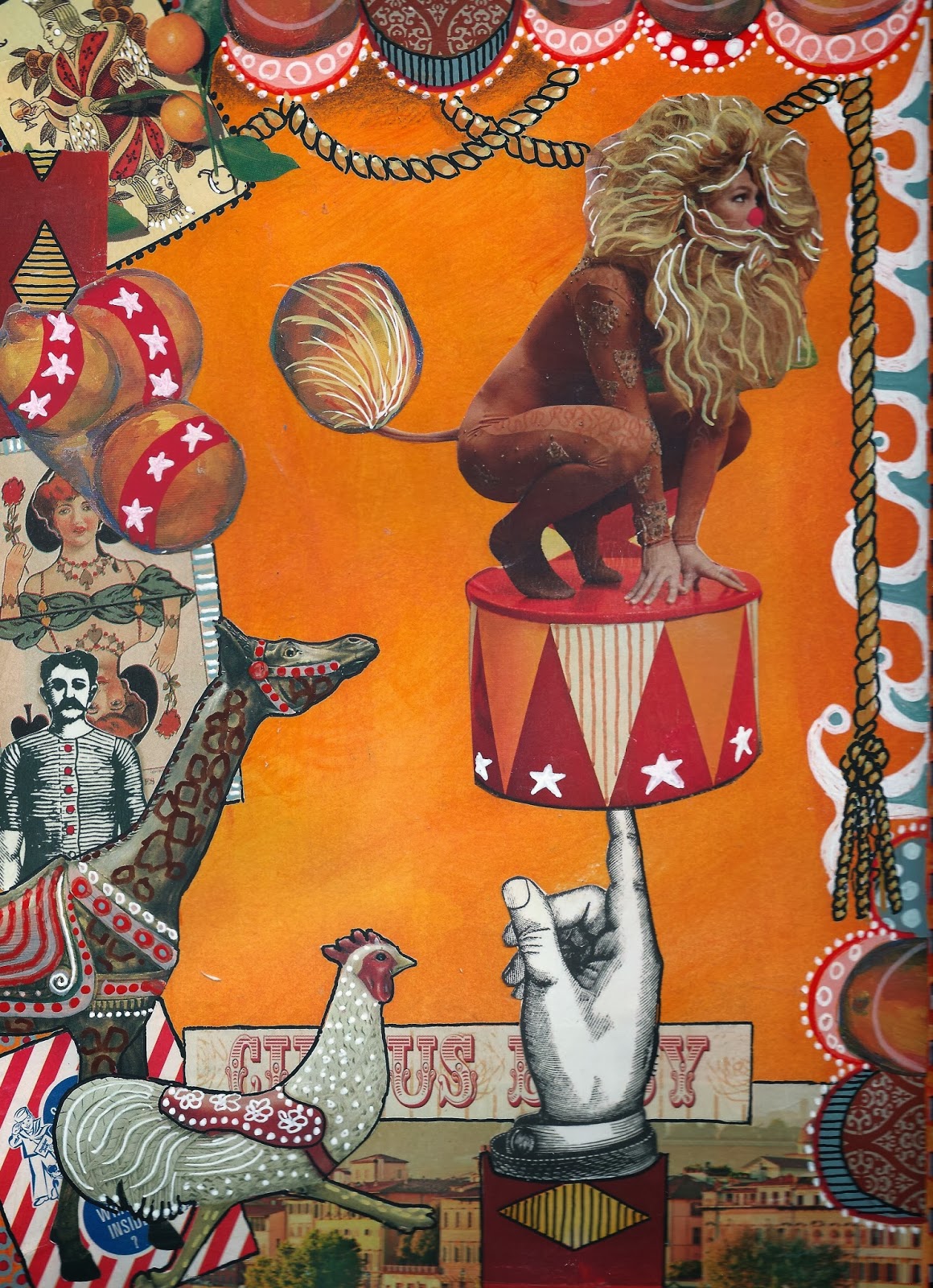
I told you that I would walk you through making a Teesha Moore type collage and share many tips that I learned from her in the class "Mermaid Circus."  Well...here goes!

LIST OF SUPPLIES:
  • Substrate...I like Mixed Media paper 140 lb.  A heavy weight  Watercolor or Bristol paper works also. 
  • Magazines and ephemera of all kinds.
  • Matt Medium (I use Liquitex), Mod Podge or glue stick (Use a good glue stick one like Elmer's Photo or UHU, not School glue).
  • Scissors
  • Acrylic paint...craft paint or the more expensive variety.  Any will do.  My fave is Liquitex soft body acrylic in the small flip top bottles.
  • Mister bottle filled with water.
  • Two 1" wide flat paintbrushes.  One to apply background color and a separate one to apply the Matte Medium. 
  • Acrylic paint pens. (Not oil based pens.)  Extra fine and fine (1mm & 2mm).  I like all brands..Elmer's Painter's, Sharpie, Sharpie Poster Paint, Molotow, Posca...to name a few.
  • Gel Pens.  I love the Gelly Roll Moonlight, Souffle and Neon.
  • White Uni-ball Signo pen UM-153.  (I buy these on-line by the box from Jet Pens).  The best opaque white pen although the ink is not water resistant.  If you need it to be water resistant, use an acrylic paint pen such as the 1mm Molotow.  Good to have both.
  • White charcoal pencil.  Mine is General's.
  • Kneaded eraser. 
  • Prismacolor Premier pencils for shading.
  • Paper towels.
Tip:  All types of glue have their pros and cons.  The pro regarding Liquitex Matt Medium is that the Prismacolor pencil works well with it...the con is that it is very wet and the paper tends to wrinkle more than the other adhesives.  The pro for Mod Podge is that it is easy to work with and wrinkles less but the con is that the Prismacolor pencil does not work well over it's slick surface.  The pro for a glue stick is that the paper wrinkles less than the other two but the con is that it is difficult to apply to thin paper and larger pieces (it sometimes dries before the piece is applied).  It takes practice and a little experimenting to find which adhesive works best for you.  

Tip:  A word about pens.  I only use acrylic paint pens and gel pens over acrylic paint, matte medium or Mod Podge.  I have ruined many a Micron, Pitt, Copic or other type of alcoholic marker by using them over acrylic paint and dried adhesive.  It is also useful to know that gel pens are not water resistant and should be used last.  Do not paint the matt medium or Mod Podge over the gel ink as it will dissolve the ink and smear.  If this happens, use a damp paper towel to carefully wipe it off and start over (before it dries assures good results).

Tip:  A good white and black liner that is permanent when dry and writes on most surfaces is the 1mm Molotow.  These are also refillable.

PREPARING THE SUBSTRATE:

Squirt a little acrylic paint randomly on the paper.  I may use two or three colors for this purpose.  Keep the paint in the same color family or use analogous colors (next to each other on the color wheel).  Do not use complementary colors or they will make mud.  If you wish to use complementary colors just don't mix them together...use them side by side with minimal overlap or wait until the first color is dry.

After the paint is globed on the paper, mist the page lightly with water and then quickly paint and blend to cover the entire page.  Just as quickly, grab a paper towel and rub the paint in a circular motion to create a smooth finish. (I learned this from Teesha.)  Don't worry if it is not completely blended...most of the background will be covered with collage and what doesn't get covered, the little imperfections will add interest. 

TIP:  Teesha paints both sides of the page before she begins the collage work because wetting the back side of a finished collage with paint or Matte Medium may loosen the glue on the collaged side.  (Why this never occurred to me before is beyond me!!!)

I paint both sides of several pages at one time...then do the college work on all the pages...and then embellish them when the mood strikes.  I found it interesting that Teesha takes her work with her to the coffee shop and has several pages collaged and ready to embellish with doodles and markings.  That way you only need to carry pens and pencils in addition to the collaged substrate.  I haven't tried this yet but I plan to!  Starbucks...here I come!!!!

FINDING COLLAGE MATERIAL:

Collage material is everywhere and needn't cost much.  Here are some to consider:
  • Magazines of all kinds.  Look for colors and textures that you like as well as graphics and photos.
  • Used art books or children's books.
  • Wrapping and scrapbook paper.
  • Printed paper napkins.  These are three ply and need to be separated...only use the top and printed layer and use spray glue or gel medium to apply (they tear easily if the glue is too wet).  Also, they are somewhat transparent so keep that in mind when layering over other collaged pieces.
  • Your own printed papers.  Gelli mono prints are great for this.
  • Prints of your own art work.
  • Prints of non-copyrighted art or photos. 
  • Free or purchased collage sheets.
  • Ephemera such as old letters, photos, ticket stubs. candy wrappers, etc.
Tip:  Teesha also recommends for their graphics...magazines such as, IND, 3X3, Hi-Fructose and foreign fashion magazines.

ORGANIZING YOUR COLLECTION OF COLLAGE PAPERS:

Now is a good time to talk about organization and how to store your collage papers.  It would take way too much time to look through each magazine, book, etc. each and every time that you plan to collage.  You must have a way to store and organize your papers.  Whether you store and separate them in boxes or folders, find a system that works for you.  

This is how I collect and store my papers:  When I am finished with a book or magazine, I rip out the  pages with interesting colors, textures and pictures keeping in mind how I might use them.  For example, I might like the colors used in a magazine advertisement or the texture of a piece of clothing.  These can be cut into shapes or used as boarders.  I also cut out people and use the whole person or just a body part like a head, arm, leg, feet or hands.  I also cut out any graphic or picture to use in it's true form, like a flower, shoe, purse, cat, dog, etc. Do you get the idea?

I separate and store my pictures in folders.  These are some of the various categories by which I store my stash:  Faces, Body Parts, Adult People, Children, Birds, Animals, Made Paper, Ephemera. Colors and Textures, Quotes, Words and Phrases, Famous Artist's Paintings, and Floral.

By filing my collage material this way, inspiration is only a folder away.  I can look through a folder and always find a clipping by which to build a journal page around.

SELECTING COLLAGE MATERIAL:

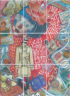
First, I find my focal piece.  In the collage of the girl in a raincoat, it was her big head with the blue hair.  The next step was to build her body.  I auditioned many magazine clippings until I finally decided on the raincoat.  Next, I found her hands and legs in the "Body Parts" folder.  See?  If you have a filing system, it is easy peasy to find what you are looking for.  I didn't have to thumb through several magazines.

Once the girl was decided, I started looking for ephemera and paper with the textures and colors that would go with the girl and background.  I pull everything that might work and make the final decision later.  

CREATING THE COMPOSITION:

I audition many pieces until I find the combination that works well together and then make the final cut and start laying out the composition.  Don't put too much time and thought into this as when you start your mark making/doodling...things will really begin to change and that little piece of paper that you were fretting over...fades away.  

There are, however, some basic rules that I like to follow.  The first is that I like to repeat colors and patterns in more than one location on the page...second, I like to vary the size of the collage pieces (large and small) and third, I do not like to center the focal piece. I just feel that for ME...following these rules makes the page more interesting.  

RULE OF THIRDS (Optional) 

Rule of Thirds:  Do you notice how I positioned the girl toward the left side of the page?  I did this because I needed to leave room for the lettering and also because I like to use the "Rule of Thirds."  In case you don't know what this is, it is a rule of composition that many artists and photographers use because it is believed to create more energy and interest.  Wikipedia explains the "Rule of Thirds" as: "The guideline proposed that an image should be imagined as divided into nine equal parts by two equally-spaced horizontal lines and two equally-spaced vertical lines, and that important compositional elements should be placed along these lines or their intersections."  The most important element in my composition is the girl's head so I positioned it toward the left and top third of the imaginary grid.


I only mention the "Rule of Thirds" because if you are having difficulty with the layout of your page and you are not liking it so much...try the "Rule of Thirds."  It might change everything!  However, if you are happy with the focal piece being centered...there is nothing wrong with that too.  In Art Journaling...there are "No Rules."  What matters is that YOU like it and are having fun with the process!

I do need to say, however, that Teesha has some spectacular art work where the focal piece is CENTERED!  See?  Just my personal preference!

GLUING THE COLLAGE PAPER TO THE SUBSTRATE:

When you are happy with the composition...start Trimming and gluing!

Tip:  With so many pieces to glue...how do you remember your final layout and where to glue the pieces when you need to remove the pieces on top in order to glue the bottom pieces?  Simple...take a picture!  

Now...If you have never used Mod Podge or Matte Medium to glue collage pieces...this is the way that I do it:  I always start with the bottom pieces and build the layers up as I go...the focal piece is usually last.  I use a 1 inch brush (an old worn watercolor brush for this purpose.  You could use a foam brush.)  I apply the Matte Medium evenly to the substrate in an area large enough to cover the area of the piece that I am collaging.  I position the collage piece where I want it and then brush over the piece to smooth out any air bubbles.  In essence, you are now applying the Matte Medium that is left on the brush on top of the college piece.  

The Matt Medium dries clear so don't worry about getting it outside of the working area.  Just make sure to smooth it out so it doesn't leave ridges when dry. The trick is to use enough Matte Medium to adhere the piece but not to soak it. The wetter the piece (especially magazine clippings) the more wrinkles you will have but don't worry about them either...as the paper dries, a lot of the wrinkles will disappear.

When gluing with Mod Podge or Matte Medium...once you stick it down...there is no getting it repositioned without making a mess and ruining the paper clipping. Having said that...for pieces where the position is critical and for larger pieces, I leave the collage piece on the substrate and lift one side of it...apply glue under it and paint out the bubbles...then I lift the other side and do the same thing.  Be sure that you get the glue under the middle area where the lifted sides meet!

Tip:  When I use a glue stick, I always apply glue to the back side of the collage piece and then apply it to the substrate.  Always apply the glue by starting in the middle and moving the glue stick out toward the sides and off the paper.  This eliminates the problem of the glue globing under the collage piece.  Use an old telephone book or magazine as a gluing surface to catch the excess glue.  When the page gets covered in wet glue and there is no dry spot left just rip off the page to expose a nice dry page underneath.  


DOODLING AND MARK MAKING:

Okay...Now is the time to grab all your paint pens and gels pens and start embellishing what you just glued down.  But first...make sure that you have given your work enough time to dry.  Using your pens over a surface that is not dry is a sure way to ruin your pens.  I cannot stress this enough!!!!

I start my mark making by outlining pieces that need be lifted from the background or the piece below it.  Next, I like to use a white pen and make dots or circles followed by using colored pens.  I don't over think this process and find that if I doodle and then doodle some more...I usually like the end result.  I keep going until every collaged piece has been marked in some way.

Now...I know what you are thinking!  You may not be a doodler and don't know where to begin with making patterns.  Well...there are lots of Zentangle books and books about doodling or you can even make your own.  That's what I did because I am not a doodler either.  I find patterns that appeal to me and draw them in a reference journal that I made for that purpose.  I did the same thing with different lettering styles.  Now when I get stumped for a pattern...I turn to my journal.  This is a great way to prevent a creative block!  Too much thinking can sometimes stifle your creative process!!!


LETTERING:

I have adopted Teesha's style of lettering (for now) because it is easy for me to do and I think that it looks great!  It was amazing to watch Teesha letter because she does not lay it out in pencil first!!!  She has been doing it for sooooo long that she instinctively knows how to space the letters and words.  The other thing that Teesha does is to mix upper and lower case, the size of the letters and the angle of the words.  Oh...I almost forgot...she fattens the letters and adds the serif as she writes them.  In other words...she does not do all the lettering first and then go back to fatten them and add the tails. 

You may have your own style of lettering or prefer something different from what I have used.  There certainly are plenty of examples on the internet in which to choose from.  Place as much importance in drawing your letters as you have in the art work.  The lettering IS part of the art!!!!

Tip:  Use a white Charcoal pencil to rough out the lettering first and once the ink is dry, erase any remaining charcoal by using a kneaded eraser.


SHADING AND FINAL TOUCHES:

I always like to have the light source coming from the upper right corner of the page.  Another personal preference.  However, you may feel more comfortable with just the opposite.  When I shade the letters or objects in the picture, I shade the left side and bottom a darker color and if needed, highlight the opposite (light source side) side with a lighter color.  Don't get too concerned about making this happen though...some of the pieces from the magazine already have their light source established and it may not agree with your overall scheme.  Notice how the girl's head is darker on the right and lighter on the left?  Just the opposite of how I shaded the rest of the collage.  Oh well...It is what it is!!!!  Hopefully not too many people notice!  lol!

To add depth to the background and some of the key elements like the flower in her hair and the ribbon, I shaded with Prismacolor Primer Pencils.  I love these waxy pencils because it is possible to    go from very light, by using a very light touch and pressure, to a very dark color by applying a much heavier pressure.

I did not pay attention to the light source when shading the background and shaded all sides as well as all sides of the girl.  I wanted to give the effect of the girl and boarder floating above the background.


HOW TO MAKE THE STRIP FOR THE EYES.

Because the raincoat is transparent, I wanted to give the illusion of something transparent over her eyes.   I did this by placing deli paper over her eyes and drawing the eye area with a lead pencil.  I used a white acrylic paint pen (you could use white acrylic paint) to paint the back of the deli paper.  Once dry, I glued it to the face and outlined it with a black pen.

SOME OF TEESHA'S RULES:

1.  She never tears anything and slaps is down.  "Everything has a clean edge."
2.  She never puts a square or rectangular shape piece of collage at a angle.
3.  She never leaves "gaps between pieces" used in a border..".they need to be connected."

One final word...My collage work does not look anything like Teesha's latest work. I would love to be able to do what she does but there is only one Teesha and I think that it is important to keep your identity in your art and not try to be someone else.  We are all unique!  So...kick back, put on some music,  enjoy the process and be YOU!  Most of all...Have FUN!

There you have it!!!  The process for making a Teesha Moore style collage.

I hope that you enjoyed this tutorial and decide to give collage a try.  I also hope that you will someday have the opportunity to take a class from Teesha...that is, if you haven't already.  She is an amazing artist and teacher!!!

Please let me know if you have any questions.  I love to share my art experiences and would love to hear about your's also!!!

Hugs,
Ginny

Sunday, October 6, 2013

TEESHA MOORE INSPIRED JOURNAL

I just bought a new journal to work in and decided to dedicate it to Teesha Moore inspired collages.  It is a Strathmore 9" X 12" Mixed Media Visual Journal with 140 lb. vellum finish paper and is larger than any of my other journals.  It will be perfect for collaging!

I really had fun making these two journal pages and can't wait to make more!  The process of selecting the papers to use in the college really appeals to my creative design sensibilities.  A little known fact about me is that I have always had a desire to be an interior designer...I love to mix patterns, textures and colors. The second most fun thing that I like to do is drawing patterns and textures... making lots of tiny dots, drawing flourishes, shading with pencils and I can't forget the lettering....  I was a graphic artist once and could probably letter in my sleep!  I guess when you put all of this together you can see why Teesha's style of collage really appeals to me.  It is a mix of everything that I love to do!


I hope that you enjoy my latest creations!  I will walk you through the process in my next post and share many tips that I leaned from Teesha in her on-line class "Mermaid Circus."

Teesha has graciously given her permission to share her journaling techniques. She states that "it has always been my goal to get as many folks as I can on-board with journaling.  I think that we can make this world a better place if we are all creating everyday."  Don't you agree with Teesha?  I sure DO!

Until next time!

Hugs,
Ginny


Saturday, September 14, 2013

ANOTHER "BABY GOT BACK TO BACK" JOURNAL


This is another "Baby Got Back To Back" journal that I learned how to make in Roben-Marie Smith's class with 21 Secrets, an on-line class.  In case you didn't see my previous post on the first journal that I made, this is a double-sided journal made from a gift bag with a raffia handle.

This project is named "Baby Got Back To Back" because the journal actually has pages on one side and then flips open to the other side where there is a second journal.  I love the versatility of these journals and have made two so far and given both away as gifts to artist friends.  The next one that I make...is MINE!


Front journal - elastic to hold pens or pencils and Bristol paper pages

Back journal - pocket to hold erasers, stumps, etc. and watercolor paper pages.


Wouldn't these make nice travel journals?  Everything...pens, pencils, water brush, etc. can easily be carried with you everywhere you go.  It even has a handle to boot!!!!

Until next time!
Hugs!
Ginny

Monday, September 2, 2013

WOW! 59 POSTS...59 MEMBERS!

I want to thank everyone for following my blog and lending your support.  
I just noticed that I have 59 posts and 59 wonderful followers!!!  
I just love it when things of coincidence happen...like matching numbers.
I feel like the whole universe is going to open up and shower me with riches.  
The bells go off and the confetti falls...like I won the lottery or something...lol!  
Anyway, in honor of this serendipitous moment, I think that I will switch it 
up a bit and give you a peek at what I have been working on lately.  
TIN JEWELRY!


These are earrings made from a recycled tin box.  The kind that cookies come in at Christmas time.  Would you like to know how it was done?  Well...I completely cut the tin box apart using a metal shears that I purchased from the jewelry supply store, drew the shape with a Sharpie pen (on the back) and then cut it out with the metal shears.  To finish the edge of the earrings (the tin is sharp), I filed the rough edges with a metal file and then went over the entire edge with a fine grit metal sandpaper.  I also used a dap mold and dap tool to hammer a curved shape....although, this is not necessary.  Lastly, I used acrylic paint pens or enamel nail polish to paint the design, punched a hole in the top with a metal punch or drill and then added the earring wires.

Clockwise: Hammer, metal punch, metal shears, file, cut tin, dap tool and wooden dap block
Hope that you enjoyed this tutorial and that I have inspired you to try your hand at some simple metal forging.  It's challenging but FUN!

Until next time!
Hugs,
Ginny

Saturday, August 24, 2013

DYED PAPER


A friend of mine and I have been experimenting with dying our own paper using different plants, fruits and vegetables.  We were inspired by Laura Ryan's article "Boiled Books" in the Summer 2013 edition of Pages by Cloth Paper Scissors.  In the article Laura explains how she uses different plant materials, sandwiched between sheets of watercolor paper and boiled in a bath of water and vinegar to release the magnificent colors and patterns of the organic material.  

So...with my scouts looking out for different flowers that were thought to release eye catching colors, I started collecting and preserving flowers in my refrigerator until I had enough variation to start the process.  You can freeze the plants too.

Listed below are the plant materials that I used to make the papers pictured but you are not limited to those....there is a whole world of possibilities out there. Experiment!

Ferns - mostly provide pattern
Bushes with leaves - mostly provide pattern
Yellow onion skin - provides mustard and brown colors
Purple onion skin  - provides grey and purple color.
Sliced  red beets -  provides beet red color
marigold flowers - provides orange, mustard and rust colors
Whole blueberries - provides deep blue color
Purple queen plant _ provides delicate purple color and great pattern
Dried crasins - provided only pattern...interesting
Dried Cinnamon - provided a deep rust color
Dried mustard - provided a yellow orange color
Tea and coffee grounds - provided a tea stain look... some speckles.
Sliced strawberries - provided light pink color but the seeds made a great pattern.
(Note: My friend used dried eucalyptus and the dye from the plant added a beautiful turquoise color.  Consider dried flowers that you might already have as they can often give off rich colors.)


This is the process:

You will need the following material in addition to the plant materials:

  • Sheets of 140 lb watercolor paper  (I used Strathmore 300 but my friend used Printmaking paper and the more expensive Arches paper and the colors were much more vivid and the patterns more distinct. The author recommended 100% cotton rag.  I discovered that the paper does make a difference.  Next time I will use Canson 100 which is 100% cotton.)
  • A large stew pot. 
  • Heavy cardboard, matte board, or plywood cut to the size of your paper but not so large where it will not lay flat in the stew pot.  (I used two hot pads that were metal on one side and paper on the other.  I found them at a discount store for $1.00 each.)
  • Rubber bands, string or clamps to hold the cover tightly to the papers.
  • 1 cup white vinegar. 
  • Tongs, cookie sheet and newspaper.
  • Something to weight the paper stack in the water (a brick or heavy object).  It needs to be completely submerged.

1. Cut or tear (gives a nice deckled edge) the watercolor paper to size.  I made several paper sheets and folded them in half.  Position the vegetation between the fold.  Both sides between the fold will be dyed but the back side will not.  (If you wish, you could fold the paper into an accordion and place the vegetation between all folds, front and back, so it will dye both sides of the paper. Don't forget the top and bottom of the stack.)

2. Place the flowers, branches, fruits and vegetables on one side of the paper.  Fold over to enclose the vegetation inside the fold.

3. Stack the papers with the vegetation between the folds and place the cardboard or cover material on the top and bottom of the stack.  (Squish it down.) Secure with clamps, rubber bands or string.

4. Fill a stew pot with water and 1 cup of white vinegar. Completely submerge the stacked paper in the water and use a brick or heavy object to weight it. Bring the water to a full boil and then reduce to simmer and cook for 1 1/2 hours.

Note:  If you want a darker result, you can add coffee, tea, or additional plants to the water.

5. When finished cooking, use tongs to carefully remove the paper from the water and set it on a cookie sheet lined with newspaper.  Careful....don't burn yourself or get any of the juice on a light colored formica counter top...it could stain.

6.  Allow it to drain overnight.

7.  Very carefully, unwrap the papers and remove the large pieces of vegetation. The paper is very fragile when wet and you may need to allow the paper to dry completely.  Once dry, use a soft brush to remove the remainder of the vegetation and if necessary, the pages can be ironed to flatten.


Don't forget scraps to make mini books.
Well...that's it for now.  Let me know if you try this process and your results.  I would love to know what you use for certain colors and how you use the dyed paper.

Hugs,
Ginny

Monday, August 5, 2013

MORE ATC's (From magazine ads)

These were really fun to make!  I was looking through the Sunday paper when I came across a J.C. Penney's ad and something about the model's pose and facial expression struck me as unusual and perfect for using in my ATC's.  I don't know why I liked these better than the ones in fashion magazines... something about them!!!  Maybe an attitude???? 

The very first one that I made, the boy with the green tie, I hated and almost tore it to shreds but from past experience I learned that everything can be fixed with a little gesso and new paint.  At first the background was too dark so the gesso helped to lighten it up quite a bit...it was a plus that some of the underlying color bled through the gesso and tinted it so that I didn't need to recolor the background...I just doodled over the top with Gelly Roll pens.  I also didn't particularly like the painted tie but now I think that the tie is what really makes it interesting.

The backgrounds were left-overs from making stenciled inky journals or from failed art work and the doodles were made using Gelly Roll pens and my fave, a white Signo Unaball pen.


Until next time!
Hugs!!!
Ginny

ZETTI STYLE ATC's

I think that these are my favorite of all the ATC's that I have made recently.  I love how the  clip art images go with the stenciled inky paper and their over all quirkiness.  I know that human heads on animal bodies or vice versa is nothing new but the process for ME was really gratifying.  I NEED to vary from the norm..."step outside the box" every now and then.  I am a conservative type of gal and need to try something different.  You know what I mean???

Anyway, I hope that you like them. 


Until next time,
Hugs!
Ginny

MORE ATC's - LET'S HEAR IT FOR THE GUYS

I found these handsome fellows in my clip art collection and thought that they would be fun to use with my ATC's.  I especially love dressing them in PINK!  lol! Makes it more interesting...don't you think?

The backgrounds for these were made from left-over stenciled inky paper from journal making, failed art work and free papers from Summerset Studio Magazine.  The paper from Summerset Studio was a little thin for my liking so I backed them with heavy card-stock and then stitched by machine around the edge.  All the doodles were made using Gelly Roll pens, a black Pitt pen and a white Signo Uniball pen.


Until next time!
Hugs!!!
Ginny

MORE ATC'S

Do you have art supplies that you rarely use because you tried them and didn't like the result?  Maybe you need to give them another try.  That's what I did with my Gelly Roll pens and now I love them!!!   I bought mine ages ago and never used them until now because...well, I just didn't know what to use them for.  The size of the pen width is just perfect for a smaller projects like ATC's!

My favorite sets of Gelly Rolls are the Moonlight, Soufflés, and Metallics.  The Metallics are just that...beautiful metallic colors, the Souffles are beautiful light to medium matte colors and the Moonlight are bright, almost neon colors...all three sets write over black.  Yummy colors!!!!

I am finding that all the various kinds of pens: alcohol markers, watercolor Tombows, Gelly Rolls etc. all have a purpose...it's just a matter of determining which inks work with which surfaces.  Which pens work on the slick surface of acrylic paint or on water reactive paints and pencils, which write on light or dark colors, slick or textured surfaces.  It's a lot to think about but something that is worth knowing.

For the following ATC cards, I used mostly the Moonlight Gelly Roll pens and a few Gelly Roll Souffles.  The White and black ink lines were made using a white Signo Uniball and black Copic multi-liner pen.  These pens are wonderful when writing over watercolored backgrounds and dark colors but don't get them wet or use a water based varnish...the ink will smear!!!  (The Copic multi-liner is permanent and will not smear when used with water reactive paint or ink.)


This is how I made the ACT's:


Find a patterned paper to use for the background and cut it to size: 2.5" X 3.5."  I used an inky scrap of watercolor paper left over from a journal that I made.

Find a picture for the focal piece from the internet or clip art book.

Cut out the image and glue it to the card.

Determine where to frame the image with the outline detail.  Mark first with a white line and then very carefully mark with a parallel black line.

Now, doodle using Gelly Roll pens...draw spirals, dots, outlines, flowers, etc.

Use your imagination to make an ordinary image "over the top."

Tip:  If the paper that you used for the background is too thin, consider backing it with a piece of cardstock or thicker paper and machine stitching around the edge.

That's the gist of it!  Easy Peasy!!!!


Hope you enjoyed my ATC's and tutorial!

Until next time,
Hugs,
Ginny